Cool stuff and UX resources
Introduction
People notice people. For lots of reasons, we are built to do that. As such, the presence (or not) of people in images can change how we look at, move through, interact with, and interpret a painting, a magazine, or even content on an individual page.
You know those photographs where no matter the angle, the person is looking directly into your eyes? Direct eye contact is particularly arresting. Our attention goes directly into the gaze. And it can be hard to break direct eye contact – even when the other person is on paper.
So, eyes draw attention. But eyes also guide attention. We (or at least most of us) are naturally interested in what other people are interested in.
For instance in the image to the left, chances are high that your gaze initially tracks to Sophia Loren's eyes, and then with her gaze, with a goal of finding what captured her attention. Though fortuitous here, thoughtful composition drives viewers' movement through the composition... and in some cases out of the frame and toward the next desired element.
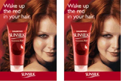
Consider the images below. In the first case, the model's arresting gaze draws YOU in – personally. In the second, her gaze drives you toward the target product – but at the expense of failing to create that personal connection.
Is one composition more effective? There is certainly emotional power in the direct eye contact. It’s personal. But the real question is this: where do people's eyes go once they break that eye contact? After all, making a connection is not valuable unless viewers also make the connection with the brand. So to be effective, an image needs to draw people in but also to drive them to look towards the thing being touted.
Eye tracking provides an easy, objective way to sort this out.
Eyetracking studies capture where people look, how they move (visually) through a page, and how long they linger on the various spots. (For websites studies, they can also capture mouse movement and clicks.)
Results are often conveyed in "heatmaps" overlaid on the original image. Hotspots (the red ones) on the heatmap define where people looked most, lingered and looked most often.
Provided the eyetracking analysis, the effective image is easy to pick out. When the woman looks at us, we tend to look at the woman and the tagline and ignore the product. When the woman looks at the product, we tend to look at the woman, the tag line and – most critical for the advertiser – the product.
Look at THAT. Composition matters

References
Bunnyfoot.com (2006). Get real focus from your customers - try something different from focus groups.
Message from the CEO, Dr. Eric Schaffer — The Pragmatic Ergonomist

As we move toward persuasion engineering we must attend carefully to how our user's attention is shaped, as well as their emotional reactions. This is important in a simple advertisement. But this is also important, and more complicated, in the interactive world of online media. We have long modeled and shaped our user's interaction to ensure good performance. Today that requirement is a given. Now we have to shape the user's attention to see the things we want seen, and we need to shape the user's emotional reaction so that we reach our persuasion objectives.
Find out more about the dynamics of persuasive design
Leave a comment here
Reader comments
Jeanne Wilson
I think it would be interesting to see an additional study on where the user would look if the model was looking at the product and the product was shifted up with the tagline below it.
Just for grins...
Ann Pinion
The article by Kath Straub is fascinating. I attended her class in Austin at the Government Technology Conference and was very impressed with her and HFI.
The article "Look Composed" reminded me of something I have been thinking about: Is marketing getting too good? At what point does psychological manipulation cross ethical lines?
Laura Dsouza
I think this is a very interesting observation and worth application. In fact studies have been made in advertising but this kind of user response "proved and tested" is definitely worth all the money and resources spent on user testing.
Raz Levinhar, Amdocs
One of the main goals of any ad is to draw us in as it competes with all other visuals for our attention. Since direct eye contact is very powerful in drawing spectator interest, the first ad might actually be more effective. The spectators who study it might pay relatively less attention to the product, but there will be many more spectators who notice it than the other alternative as a direct result of its direct eye contact. I'm not sure how the research was conducted, but based on the eye-tracking heat images, it appears spectators were probably presented with the ad and nothing else. Another interesting research would be to present an audience with a variety of ads or a complete web site that includes this ad. We can then try to weigh in the number of participants who fixated on the product of this particular ad in each of its two alternatives. I believe the results will be able to approximate real life experiences even closer.
Mitchell Heller, Heller& BAC, Inc.
While I find these results very interesting, what I do not feel was addressed is the key question of "which one resulted in more sales?".
Did the image of the woman looking at the audience appeal more to men? Does looking at the product generate a better response with women?
I feel this article speaks to how designers can elicit a desired behavior, but I think it is incorrect (based on the information disclosed) to imply effectiveness of the marketing piece.
Prashant Poladia, Monior Group
Very interesting study. That's what every director or creative designer should be aware of. If they understand all this, I am sure the ROI for their client will definitely increase.
Anand Nair, GAC
Very interesting. Informative and captivating. Keep up the good work. Appreciate more such information.
Subscribe
Sign up to get our Newsletter delivered straight to your inbox