Cool stuff and UX resources

Visionary Usability: Making Friends With Graphic Design
Introduction
How often do you talk with your graphic designer?
Every minute? (You are the graphic design and usability person!)
Twice daily? (They sit next to you!)
Three times a week? (You're in the same office.)
You have to make appointments? (Yikes, how busy can you get? Or maybe, "get to know more about graphics.")
Whatever your answer, we have some good updates on the science of visual appeal and how to make it work in a usability context.
Does usability overcome a poor visual impression?
You're in a rush to get the application or website up and running. Just how much time should you allocate for your graphic designer?
You might say "well, our usability testing showed people could find what they needed."
But that's just half the story, according to recent findings by two researchers at the Wichita State University Software Usability Research Center (SURL). Christine Phillips and Barbara Chaparro knew from prior research (which we have reported) that first visual impressions are very important in determining whether someone likes the site – even the first one-twentieth of a second!
Prior research did not cover, however, these two questions:
- Can a poor initial visual impression be reversed when given an excellent usability experience?
- Does the usability of a site influence someone more when they are accomplishing a task rather than freely exploring it?
Setting up the comparison showdown
Our two authors used two websites from their prior research: one had received high rating in visual appeal and the other had low ratings.
The authors then altered the pages so they had a "high usability" and a "low usability" version of each. They used 36 criteria from www.usability.gov's Research Based Web Design and Usability Guidelines to score the designs.
Four groups of 40 people reviewed the pages, one group per web page. Each person had 10 seconds to examine the homepage. Then they completed 3 short surveys:
- A 9-question adjective survey about the design (e.g., simple, interesting, good layout, easy to use)
- A 10-question interest survey about the site appeal (e.g., I want to spend more time on this site, the homepage is an accurate representation of the site)
- The 10-question System Usability Scale (SUS) (see prior article)
After completing the surveys, participants were given 15 minutes for one of these assignments: a) a series of randomized search tasks or b) free exploration of the site. Upon completion, they completed the 3 surveys a second time.
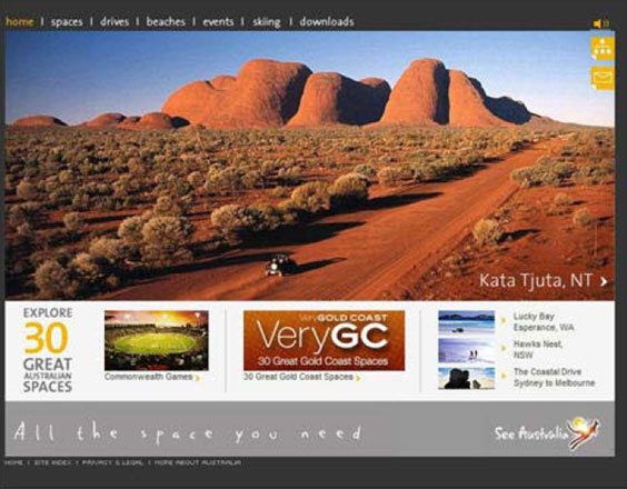
Figure 1. High visual appeal website: www.australia.com
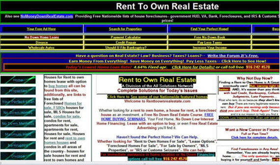
Figure 2. Low visual appeal website: www.renttoown.com
First impressions count in the usability count-down
As expected, the "high visual appeal" site (including both "more usable" and "less usable") scored higher on all three surveys after the 10-second viewing.
Of greater interest, after 15 minutes of participant web usage, the authors found answers to their initial questions:
1) For all three survey measures, the high visual appeal site still received higher scores than the low visual appeal site even for the low usability design. In fact, participants rated the low usability version of the high visual appeal site better than the high usability version of the low visual appeal site!
In other words, good usability didn't make up for low visual appeal.
2) On the other hand, participants assigned the search-tasks rated all 4 types of screen lower than participants who conducted free exploration of the site.
This means that task-orientation made users more critical in general when compared to users conducting free-exploration of the sites. In these cases, searching placed demands on usability.
The authors conclude that high usability cannot overcome a low visual appeal.
In summary, the usability of the site fails to overcome whatever bias, good or bad, introduced by the first visual impression. Users form attitudes that confirm that bias during the subsequent site interaction.
The authors write "The results support the confirmation bias theory proposed by Lingaard and Dudek (2002) in that the users' first impressions held true even after using a site that was not usable."
Food for thought about graphic design
While we are typically more than willing to let our graphic support people do their thing, some researchers ask if there is a rapid way to review quality of graphics using automated support.
For instance, on large-scale websites, how can you maintain an acceptable level of aesthetic value without an army of graphic artists?
Sheng, Lin, Chakraborty and Rauschenberger of Siemens Corporate Research report their 2009 findings from "pixel-level statistics that are agnostic about the existence of objects, meanings, cultural or discipline-specific conventions, etc."
In other words, they wonder if a computerized metric of images (symmetry, balance, and equilibrium) can correlate with the rapid judgments made by non-professionals regarding aesthetic dimensions (described next).
The authors focus on impressions made in the first 150 milliseconds of the "pre-cognitive" phase of perception. 22 participants viewed 30 web pages presented in different orders and rated each page on these four aesthetic dimensions. They had 1 minute to perform their rating.
| Repelling |
(1)…(2)…(3)…(4)…(5)…(6)…(7) | Appealing |
| Complicated | (1)…(2)…(3)…(4)…(5)…(6)…(7) | Simple |
| Unprofessional | (1)…(2)…(3)…(4)…(5)…(6)…(7) | Professional |
| Dull | (1)…(2)…(3)…(4)…(5)…(6)…(7) | Captivating |
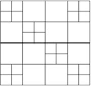
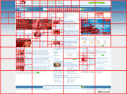
Figure 3. A pattern high in balance but moderate in symmetry.
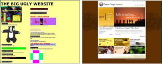
Figure 4. Left: least balanced or symmetrical of the pages. Right: most balanced and symmetrical.
Figure 5. This image measures low on "equilibrium" because the center of mass is clearly to the top left of the physical midpoint of the image.

Figure 6. Example of quadtree decomposition. The more unpredictable pixels present in the quadrant, the deeper and greater the number of child quadrants or "leaves".
What the computer saw in the images... 
The automated analysis drew from existing work in calculating measures extracted from viewing the web page as an "image". These measures counted variations in RGB color, luminance intensity, and spatial texture. Collectively they create perceptions of balance, symmetry, and equilibrium as follows.
1. "Balance" applies to the page elements on either a left/right or top/bottom comparison. Similarity of elements on both halves will increase the measure of balance. Note in Figure 3, that the elements are not "symmetric" even though the image has the same elements.
2. "Symmetry" refers to the degree to which the opposing half page mirrors the placement and size of the other half page. In Figure 4, the top rectangle reflects the size of the bottom image rectangle. There is also a left/right mirror of image variety, especially in the bottom rectangle.
3. "Equilibrium" measures the "lopsidedness" of an image, as in Figure 5. Distance from the physical midpoint plays a role, as in a doctor's scale for measuring body weight, where two massive image elements of different sizes might be brought into equilibrium by placing them at different distances from their physical center. They would be high in equilibrium but low in balance and symmetry.
"# of Quadrants". This shows information density as measured by iterative analysis of pixels in a page quadrant. A high number of quadrants reflects greater recursive depth at which pixel differences cease to be unpredictable. Thus, regions with dense information will contain a larger number of "leaves" (child quadrants) and will be perceived as having greater complexity.
Aesthetic outcomes from computerized analysis
The authors found their computer analysis correlated with subjective findings on three of the computer-generated measures: balance, symmetry, and # of quadrants.
The authors suggest that equilibrium failed to correlate with any rating because web pages, by convention, are not organized around the midpoint of the screen.
On the other hand, balance (and symmetry to a lesser degree) constitutes the main tool by which graphic talent provides professional and appealing layout.
The # of quadrants has a negative correlation with "simple" and "professional". The more quadrants we have, the less simple and the less professional the rating. While this may sound challenging to overcome, the authors suggest that "raw informational" content can be made pleasing with addition of balance and/or symmetry.
In this context, the authors state "the high number of "leaves" – and therefore raw informational content – allows these designs not to be dull." So it's the job of the usability (you) and graphics staff (you, again?) to add enough balance and symmetry to tame pixel unpredictability.
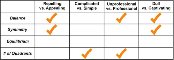
Figure 7. Statistically significant correlations between human aesthetic judgments (top row) and computer measures (left column).
The final word on visionary usability
We have come far in this UI Update.
We started with a demonstration that usability science will benefit from the aesthetic hand of our graphic colleagues. In fact, good graphical support can save our butts in the absence of good usability on a home page. And it can save everybody's butts, even with good usability.
Next, we learned that graphical evaluation of large-scale websites may never happen unless we employ the help of computerized image analysis. Home-page design is one thing. (Hang on to our graphic buddies!)
But, getting rave reviews on the other 8,000 automatically assembled pages is another thing.
Using traditional graphic concepts we find that indeed, pixels can communicate their degree of balance, symmetry, and pixel unpredictability in the # of quadrants measure.
We can translate these into useful measures of page appeal, simplicity, professionalism and avoidance of dullness.
It takes one usability visionary to see the visual in usability.
And, you are the one.
References
Phillips, C. and Chaparro, B.S. 2009. Visual Appeal vs. Usability: Which One Influences User Perceptions of a Website More? SURL: Software Usability Research Laboratory, Wichita State University. Usability News, 11 (2).
Zheng, X.S., Lin, J.J., Chakraborty, I., and Rauschenberger, R. 2009. Correlating Low-Level Image Statistics with Users' Rapid Aesthetic and Affective Judgments of Web Pages. Conference on Computer-Human Interaction (CHI), April 4-9, Boston, MA. Association of Computing Machinery.
Message from the CEO, Dr. Eric Schaffer — The Pragmatic Ergonomist

I've worried about some of the usability gurus' websites that so obviously receive no graphic attention. They seem to make a statement that "Usability is just effective presentation of content." But now John points out the reality. Our user experience field is about much more.
The user experience field is about the overall subjective experience. It is about the ability of the site to engage and influence users. It is usually about conversion. So we must incorporate graphic skill sets and processes, as well as classic user-centered design resources. Just as sites developed ONLY by graphic artists generally fail, sites developed ONLY by UX staff fail as well.
Leave a comment here
Reader comments
Art Zippel, CUA ArtZippel UI & X
This was fascinating; it brought up several things for me about influence, perception, prestige, and protecting our self-esteem. Even to the extent of significantly altering our ability to be objective regarding our experience.
I have been a visual designer since the 70's and made the switch to usability 8 years ago so I feel I am able to see and think both sides.
This research seems to support the concept that if our initial experience/perception is one of quality, professional, or having a degree of prestige, we have a tendency to alter our experience/assessment to support the integrity of our ability to make accurate assessments. After all, who wants to be viewed as an easy mark, gullible, or clueless by their peers or themselves? Who of us haven't worked on a redesign project where some of the members of the original project have been less than objective in receiving some critical thinking comments from the "new" people?
I am reminded of a story in Robert Cialdini's book, Influence: The Psychology of Persuasion concerning trying to sell some specific pieces of turquoise jewelry that wasn't moving. Because of some miscommunication the prices on the pieces of jewelry was doubled rather than halved resulting in the products being sold. Cialdini sites the concept that generally individuals, to varying extents, perceive increased cost with increased value. I think it is fair to make the comparison that if an application/web site is perceived visually as professional, then the user is going to defend that assessment further into the experience than if a lower initial assessment had been awarded.
I made the switch from visual design to usability because if I was able to build successful web sites from a visual perspective already, how much better could they be if usability principles were used in addition to just a professional appearance. It is to this end that I am looking forward to attending the PET Design training when I am able.
Even though it is well documented why the websites of Berkshire Hathaway and Jakob Nielsen are intentionally designed the way they are, I will always wonder, what if.
What a great article, it got me thinking.
Bridget Fahrland Fry, Inc.
Great research but the article seems to suggest that "graphic design" is something that is applied to user interface design as a second step.
Designers are not simply "support" or "assistance" they are an integral part of ensuring a site engages users and has a core concept or purpose that differentiates it from others. The best designs result from a collaborative effort from UI and Creative – not a "hey, come make my wireframe pretty" waterfall process. Together, a usability guru and designer should sketch out a high level approach before digging into wireframes.
Furthermore, this collaboration should go WAY deeper than the homepage. I'm not sure which site out there has 1 page with design input and 7,999 pages that are "computer generated." All large scale sites I've been involved with define a page template and visual style guide for every kind of page type. Sure there may be thousands of product pages, but they should all follow a template that a designer and usability expert collaborated on.
Go Team!
Rebecca Holder-Otte Banner Health
Eric, I couldn't agree more with you! In fact, I think usability and visual appeal are synonymous. How a page is laid out helps the user decide what to look at and how to prioritize the content, while visual cues and action items make the site functional. These two practices should always go hand-in-hand!
R. Bryon Frenyea, FedEx
High viusals draw me in. Usability exerts more pull. The speed of being able to move from one page to another keeps me there. I am willing to sacrifice some usability if I can move around quickly.
T S S Ganesan, CUA, Cognizant
This is a good article and useful for people like me who voice the opinion that Visual Appeal and Usability should go hand in hand. This research reiterates the fact that Visual impact and Usability should go together and strike a right balance. Thanks HFI for publishing this research work.
Tricia Sullivan, Raymond James
As the information designer/usability expert for the user documentation team, this article came at a very propitious time. We are currently trying to redesign our online help, and I have been struggling to convince the others on the redesign team how important actual visual design is. They tend to see online help in terms of the textual content rather than as a type of web page, which requires colors and graphics, as well as a controlled and pleasing layout to accompany the text.
So thank you for a very timely article, and any time you can provide more articles regarding the usability and information designing of user documentation, please do.
Subscribe
Sign up to get our Newsletter delivered straight to your inbox