Cool stuff and UX resources
Introduction
How should you lay out your Web site?
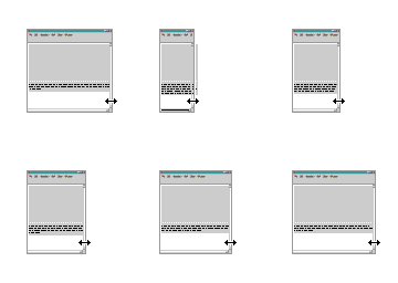
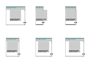
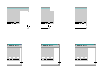
Michael Bernard and Laurie Larsen from Wichita State University published a study where they compared three layouts: Fluid, Centered (fixed-width) and Left-justified (fixed-width).
Thanks to Mark Powell at Wordscapes for allowing us to use these icons. |
The "Fluid" layout is the most traditional method, and allows the contents of a Web page to fill an entire window. In other words, it expands and contracts with the size of the window. The fluid layout is the simplest to implement, but is sometimes perceived by designers as being less modern. The "Centered" method allows users to focus on a narrower layout no matter what screen resolution they are using. The "Left-justified" method is usually slightly wider than the "Centered" layout, and is a popular method for text presentation, particularly with multi-column layouts.
With both the "Centered" and the "Left-justified" layouts, users do not have to visually scan as far horizontally, but when used on a 1024 x 768 pixel resolution monitor, it may require more pages to be scrolled vertically. Also, the latter two layouts cause considerable white space to show when a site is designed to optimize a 800 x 600 pixel resolution, and then used on monitors that are set for a 1024 x 768 pixel resolution.
The researchers had 20 participants search for specific information. Like almost half of the Web sites used today (thecounter.com -- September, 2002), the Web sites in this study were designed for 800 x 600 pixel resolutions. The test subjects used 17-inch monitors set at either 1024 x 768 or 800 x 600 pixel resolution. Half of the questions could be answered on the homepage, the other half on a second level page.
They found no reliable differences among the methods in search time, accuracy of finding information, or in search efficiency (number of clicks, use of the Back button, etc.). However, their users reliably believed that the "Fluid" layout was best suited for reading and that it allowed them to find key information more easily. In addition, users reliably preferred the "Fluid" method.
In July of 2001, Steve Kangas of NetConversions (Kangas, 2001) published an evaluation of several of the most popular home pages on the Web. A total of 87 Web sites were surveyed using a combination of manual checks and automated page measures. He reported that 49% were "Centered" with a fixed-width, 28% were "Left-justified" with a fixed-width, and only 23% used a fluid design that allowed content to grow or shrink with different browser window sizes.
Jakob Nielsen and Marie Tahir evaluated the homepages from 50 Web sites (Nielsen and Tahir, 2001), and reported that only 18% of them used a "Fluid" method (they referred to them as "liquid" layouts). The sites they reviewed were prominent in some way, including top-10 lists, world's largest companies, certain government agencies, well-run small companies and non-profit institutions.
From these studies, it appears that about one out of five Web sites (only 20%) currently are designed using a "Fluid" layout. Unfortunately, the layout most preferred by users, the "Fluid" layout, is the one implemented least often by designers.


References
Bernard, M. and Larsen, L. (2001), What is the best layout for multiple column Web pages? Usability News – Summer 2001.
Kangas, S. (2001), Layout and content of popular sites, netconversions.com.
Nielsen, J. and Tahir, M. (2001), Homepage Usability: 50 Sites Deconstructed, New Riders Publishing, 40.
Message from the CEO, Dr. Eric Schaffer — The Pragmatic Ergonomist
Leave a comment here
Reader comments
M. Wanstall
Isn't it more than a little ironic that this article was published on a centered fixed-width page?
I find it strange that with all of the resources at the fingertips of these major corporations (NineMSN, IBM, Cisco, HP etc...) they have all preferred to implement left justified fixed-width solutions. Surely they have the research and development power to be able to make justified (no pun intended) and informed decisions.
Through your research did you think of contacting some of these companies to try to find out why this approach was taken?
Brendan D.
Reading a "stretchy" site on a large monitor is not comfortable. On the other hand, restricting the size leaves you with huge white margins on that same monitor.
There is a third way, so to speak, that I use on my sites. By placing the entire page in a table set with a % width, you can compromise between ugly margins and readibility. Set it to, say 80%, and it will have acceptable margins on the large monitor, whilst still adapting to the user's display.
Not so clever, I know, and there's a catch with this: on a small display (e.g. 800), there are still margins on 20% of the screen – a waste of valuable real estate.
One solution I've found is to use a 1px white / transparent spacer at the very top or bottom of your page, just inside the table. Set the image width to 790, and your site will never shrink below this level.
The result: a Web site that displays at full screen on an 800 width, but balances margins with readibility at above. The user gets some control over the size, but within the boundaries set by the designer.
Screen width:
-------------
800 = 790
1024 = 820
1280 = 1024
Roni Korenshtein
I am surprised that the research has concluded that all three layout resulted in equal efficiency... unless of course that was the intention... Let's consider some out-of-the-lab scenario: these Web sites that are designed for 800x600 or whatever, assume their page will occupy that whole space, but often, in a windowing environment, the user needs to view two windows at the same time. Anyway, for whatever reason, the user may want to view the Web site in a window smaller than the designers have hoped for and in that case, the fluid layout adjusts the text/content, whereas the fixed size layouts would now require the user to do a considerable amount of scrolling to get to some information. So how about running the same research again, this time limiting the browser window area to something like a quarter of the monitor area? Let's see if they are still all equally efficient?
Subscribe
Sign up to get our Newsletter delivered straight to your inbox
