Cool stuff and UX resources
Are we there yet?
80% of usability is Navigation. That's what the gurus tell us. If you get the navigation right it seems almost guaranteed that users will be able to find what they are looking for on your application or site. (Note that this begs the question of whether they will look for what they can find.)
But getting the navigation right is not that easy. Several layers of design factor into effective menu systems.
First, there is the grouping of the menu elements. Then there is the organization within the groups. Are the items alpha-ordered? Are they topical? Chronological? Taskflow ordered? Frequency ordered? Then there is deriving the labels for the groups.
There are also decisions about the visual presentation and typography of the menus or navigation system. Will there be a visual hierarchy to the menu presentation?
If you are building an application, there is one more decision: should the menus be static or should they have some selection support.
Menus with selection support offer users faster access to frequently used functions. This often turns out to be critical because today's applications come with long lists of functions. These long lists of functions increase the cognitive complexity of use because they give rise to complicated nesting structures with long lists of sub-menus. Consider your mobile phone. It has roughly 20 buttons but probably more than 100 functions. Here, selection support menus provide an opportunity for the designers to highlight and provide direct access to the functions that users, in theory, use most.
Well designed selection-support menus facilitate learning for new users by offering a staged, guided path to support the discovery of available functions and useful resources. For more advanced users they provide fast access to frequently used functions. For both groups they simplify navigation structure recall by filtering the menu items into sequential sets by frequency of use.
In some implementations, the highlighted or high frequency items are stipulated by the designer and remain static. In other implementations, the menus change to reflect an individual user's use pattern over time.
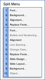
The benefits of presenting a small set of frequently used functions at the top of a more comprehensive menu list items, often called a "split" menu, has been demonstrated. Sears & Schneiderman (1994) showed that "split menus" increase both performance and satisfaction for users. In their study, split menus outperformed traditional static menu presentations. This was true both when items were presented in alphabetic order and when they were reordered within the complete list by frequency of use.

Everything is a balance
The decision to implement selection-support menus is not trivial. Menus with high frequency items presented first and/or above a fold provide fast access to frequently used functions. They may provide a recognition memory trigger for likely commands. It has also been argued that by providing a smaller set of likely items, they provide beginners a guided path toward learning a new application. Where the menus are adaptive and change to reflect users behavior, the application seems to learn and reflect the users work habits, anticipating their needs.
Assuming that the split menus are populated properly, this presentation facilitates high frequency tasks.
Despite the reported benefits of split menus, they can also present challenges to users. Sometimes the developers and learning algorithms pick the wrong items to show above the split. These menus make it more difficult to complete low frequency tasks. They undermine the user's ability to memorize the menus items' location. Because, when they are adaptive, the menu items may move around, they undermine system memorability. (This is especially true if users use more than one computer to do slightly different tasks. For instance, if they use Excel both at work and at home.) Finally, several studies show that users dislike the extra click or delay imposed by folded menus (Card, 1982, Somberg, 1987)
Because of these tradeoffs, developers still ask about when and how to use selection-support menus. For instance, how frequently do menu items need to be used to justify embedding the split menu in the first place? (Note that the flip side of selection support menus is that, depending on presentation, accidental learning of similar functions can be undermined. Users may not explore secondary menus. As such, the real power of an application may remain known.) Should the items on the split menu be static and stipulated by the designer? Or should they be adaptive and dynamically change to reflect the use patterns of the user? Finally, should the high frequency items be presented separately or in the context of the entire menu list.
Data driven design
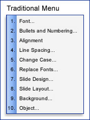
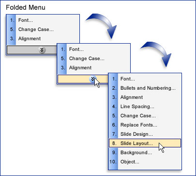
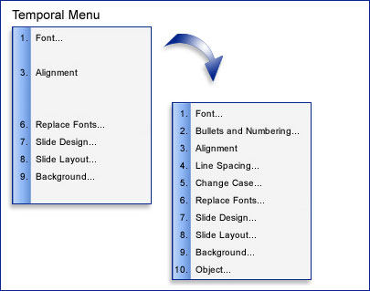
In order to begin to answer some of these questions, Lee and Yoon (2004) ran a behavioral study and conducted a simulation to derive when using various implementations of split menus make sense. In their behavioral study they evaluated Traditional (static) menus, Split menus, Folded Menus. They also added a menu type called Temporal menus. In their implementation, temporal menus are traditional menus in which the high frequency items are presented first in their regular position. After a short delay, the rest of the menu fills in around the high frequency items. In this way, high frequency items are highlighted with temporal prominence, but they do not move around in the menu.
| Menu type | Spatial Prominence | Temporal Prominence |
|---|---|---|
| Traditional | No | No |
| Split | Yes | No |
| Temporal | No | Yes |
| Folded | Yes | Yes |
The participants in this study were asked to repeatedly locate and select specific items from 7 item menus as quickly as they could. Within a session, each participant was presented blocks of each menu type to work with. The target items were pseudo-random so that each participant was asked to select a balance of items from the top and bottom of each menu. At the end of the session, participants were asked to rate the menu types relatively.
In addition to testing simple performance, Lee and Yoon wanted to evaluate how sensitive each menu type is to a change in the frequency distribution that the menu reflected changed. That is, they wanted to know what would happen if, for instance, the user changed computers or reset to defaults and the (order of the) menu items suddenly changed. To do this, they altered the menus 2/3 of the way through the experiment to reflect a new frequency distribution. They then recorded any decline in response rate based on the change.
It is important to note that the menus in this experiment were not adaptive. That is, the order of the items in the menus was set and did not change to reflect patterns of item selection on the fly.
Behavioral findings
Split menus won hands down. This menu implementation had the fastest overall performance. Participants liked it best.
For high frequency items, split and folded menus were about equal.
Performance on folded menus declines fastest as selection frequency goes down. As such, these menus are not a good choice for applications in which users exploit a wide range of functions regularly.
As can be seen below, both split and folded menu presentations proved to be sensitive to changes in frequency distribution. User performance was worse with these menus after a switch than with traditional and temporal menu presentations.
Summary Findings
| Facilitates high frequency tasks | Undermines low frequency tasks | Sensitive to location on default menu | Sensitive to changes in distribution frequency | |
|---|---|---|---|---|
| Traditional | Very low | Very low | Sensitive | Insensitive |
| Split | High | Low | Insensitive | Sensitive |
| Temporal | Low | Low | Insensitive | Insensitive |
| Folded | Very high | Very high | Insensitive | Sensitive |
When to use what?
Building on their behavioral findings, Lee and Yoon developed a network to model the impact of selection frequency on selection times. They used their model to derive the following guidelines for selecting the best menu presentation style for a given application:
Folded menus are best when users access a small, discrete set of functions 90% or more of the time.
Split menus are best when a small set of items is selected between 31 to 89% of the time and other items are selected with lower frequencies.
Traditional menus are best if there is no small, discrete set of items that is used 30% of the time or more. That is, when users don't select a just a few items more than a third of the time, the tipping point for presenting selection-support menus is not reached.
References
Card, S. K., (1982). User perceptual mechanisms in the search of computer command menus. In: Proceedings of the SIGCHI Conference on Human Factors in Computing Systems. Gaithersberg, MD., ACM Press, NY, pp. 190-196.
Lee, Dong-Seok, and Yoon, Wan Chul (2004). Quantitative results assessing design issues of selection support menus. International Journal of Industrial Ergonomics, 33, pp. 41-52.
Somberg, B. L. (1987). A comparison of rule-based and positionally constant arrangements of computer menu items. In: Proceedings of the SIGCHI Conference on Human Factors in Computing Systems. Toronto, Ontario. ACM Press, NY, pp. 255-260.
Message from the CEO, Dr. Eric Schaffer — The Pragmatic Ergonomist

The primary objective of a menu is not helping people to pick random things faster. It is giving users an overall understanding of the structure of the application or Web site. If the design is based on frequency, or alphabetical sequence; the list will be illogical. By frequency, a word processor offers EDIT, PRINT, START DOCUMENT, DELETE DOCUMENT. It is then very hard to figure out what that word processor is about. In some cases the users will spend so much time on the application that this type of comprehension does not matter much. But for most applications I would have a task-based or logical sequence so that the user understands what the application is about.
Dynamic menus are particularly worrisome. People learn by spatial location. Moving items to the top of a list might seem like a favor. But this breaks the spatial memory. The "SEND TO..." selection is no longer in the place the user expects. I can't even think of a time I would recommend that.
Leave a comment here
Reader comments
John Smith
It should also be noted that when users interact with folding menus that require the extra click to see all the choices, they will be less inclined to try menu items which they are less familiar with. This does not make them better users because they are not regularly experimenting with new ways to improve there routine. It can also be said that as they continue on a routine with limited choices they may in fact get so efficient at it that their speed may rival the better ways of doing it. So this may be a mute point.
Subscribe
Sign up to get our Newsletter delivered straight to your inbox