Introduction
An exploration of relations between visual appeal, trustworthiness, and perceived usability of homepages. Lindgaard, G., Dudek, C., Sen, D., Sumegi, L. ,and Noonan, P. 2001.ACM Transactions on Computer-Human Interaction, Volume 18, Number 1, Article 1 (April 2001).
You don’t get a second chance at a first impression. Lindgaard, et. al and many other researchers have shown over the course of the last few decades that our first impressions are critical in developing more considered opinions and for determining subsequent actions. Their most recent study on the topic had two primary objectives. First, they explored whether there were any relationships between “visual appeal” and less accessible qualities such as trustworthiness and usability. Second, they further investigated which visual attributes contributed to how we determine visual appeal, trustworthiness, and usability.
In each of three experiments, Lindgaard, et. al asked participants to very briefly (50 milliseconds) view a large number of homepage designs and then judge their appeal, trustworthiness, or usability.
In the first study, the researchers updated their earlier methodology to verify that the participants could reliably determine the appeal of a website with no chance at further processing. While their results were slightly less significant than in their earlier work, they were still strongly conclusive. We make decisions about the appeal of web sites in 50 milliseconds or less.
In the second study, they investigated whether this same pattern was also true of more complex judgments – trustworthiness and usability. They discovered that people do make judgments about these more complex notions, but that it does take a bit longer to do so.
Because they did not give participants any longer to view any particular stimulus, they could claim that participants do not have enough time to process the information any more deeply than when making the “appeal” judgments.
Because they couldn’t process very deeply, and because they were still reliably making judgments, this is taken as evidence of a “halo effect”. The halo effect means that participants were using their visceral judgments about appeal as a proxy for judging more complex properties. Beautiful things are usable. Beautiful things are trustworthy.
But what makes something appealing? That was the focus of the third study. There have been a number of models to define appeal (or “aesthetics”) over the years. Lindgaard, et. al analyzed their data with respect to six well-founded design attributes – symmetry, density, balance, contrast, graphics-to-text ratio, and text-to-background ratio.
It is not overly surprising to note that the use of graphics was a predictor in all three conditions given the very visceral and perceptual limitations imposed by the methods used. What is interesting is that different combinations of aspects of “appeal” impacted the decision making for the three judgments in question – appeal, trustworthiness, and perceived usability. As shown by the “halo effect” noted in the second study, all judgments were affected by appeal. However, what defined appeal differed given the goal of the participant.
Lindgaard, et. al have begun to tease apart the very important question of how we define “appealing.” It is clear that the goals of the participant will impact how they interpret the appeal of a given design, and that the level of appeal will impact judgments about trustworthiness and perceived usability. One design does not fit all. It is critical to understand the drives, blocks, beliefs and fears of your users in order to create a design that appeals to them.
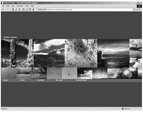
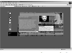
Sample images “appealing” homepages. Images that were judged to be the most appealing showed high density, high contrast, and very high use of graphics. Further, the graphics tended to use highly saturated colors.
Sample images “appealing” homepages. Images that were judged to be the most appealing showed high density, high contrast, and very high use of graphics. Further, the graphics tended to use highly saturated colors.
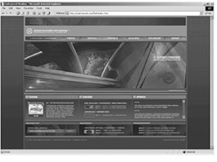
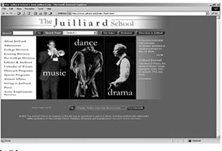
Sample images for “trustworthy” homepages. Images that were judged to be the most trustworthy showed high balance, high contrast, moderate graphics-to-text ratio, and moderate text-to-background ratio.
Sample images for “trustworthy” homepages. Images that were judged to be the most trustworthy showed high balance, high contrast, moderate graphics-to-text ratio, and moderate text-to-background ratio.
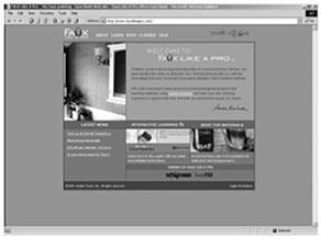
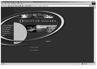
Sample images for “usable” homepages. Images that were judged to be the most usable showed high balance, high graphics-to-text ratio, and low-to-moderate contrast.
Sample images for “usable” homepages. Images that were judged to be the most usable showed high balance, high graphics-to-text ratio, and low-to-moderate contrast.