Cool stuff and UX resources

Clean Metrics from Quick and Dirty Assessment: "The SUS"
Introduction
In the youthful field of usability, we may be surprised to hear about "venerable" measures of usability. However, that's just what we have with the DEC "System Usability Scale" (SUS) copyrighted in 1986 and publicly discussed in 1996 by John Brooke.
Say you are tackling a vexing task for redesign. Would you like to get a baseline questionnaire measure of subjective "ease of use" on the original design? And then would you like to compare your redesign with a follow-up measure (to see if the design works better)?
Do you want a questionnaire to be fast, fast, and fast (otherwise known as "Quick and Dirty")?
Of course.
Time is money
And that's what motivated John Brooke and colleagues to invent a ten-question assessment that takes about 90 seconds to fill out. In fact, it's so easy your test participants could fill it out several times during a longer usability test session.
"Quick and (not so) dirty" means you can get data that measures user-friendliness by task! Plus you can compare your design progress over time!
But wait, how do we compare our design with the larger "community" of designs out there? We know that our end-users interact with many user interface designs. How does ours compare?
Wouldn't it be nice to see whether our design is just "OK" versus "good," "excellent," or "best imaginable"?
Put another way, wouldn't it be nice to know...
- Whether our user groups give our design a "C", "B," or an "A"? Get a grade!
- How well our web design encourages visitors to come back to our site? That is, how well does the design support a web site "loyalty program"? Get repeat visitors!
Let's cover two studies that answer both of these hard and practical questions.
Making the grade with your SUS metric
I've read a lot of research. Because of their visionary efforts across ten years, my hat goes off to the team of three researchers who systematically collected almost 3,500 results of SUS surveys over those ten years. The team consists of two gentlemen from AT&T Labs, Aaron Bangor and James Miller, and a professor at Rice University, Philip Kortun.
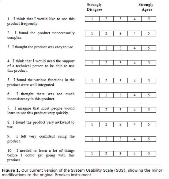
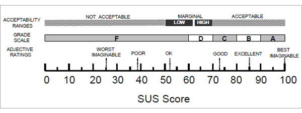
They used the SUS survey shown here across six different interface design contexts: Web (41% of the 3,500 responses), Cell phone (17%), IVR (Interactive Voice Response) (17%), GUI (Graphical User Interface) (7%), Hardware (7%), and Television (5%) interface products. (This graphic comes from their published study.)
See Brooke, J. (1996) for scoring methodology and the original text. (Our Bangor et al researchers found that the word "awkward" in statement 8 worked better than the original word "cumbersome". They also use the word "product" instead of "system".)
Mirror, mirror on the wall, who's the fairest of us all?
Our authors asked an important question, which affects us all.
What does a specific SUS score mean in describing the usability of a product?
Do you need a score of 50 (out of 100) to say that a product is usable, or do you need a score of 75 or 100?
The first part of their answer was to look at the distribution of scores across the 3,463 questionnaire results contained within their 273 studies.
- Half the 3, 463 scores were above 70 and half were below. That is, the median was a score of 70.
- The top 25% of the scores averaged for each study measured 77.8 and above.
So now we have a sense of the middle score (70) and the average score for the top 25% of studies (scores ~78 and above).
Does the idea of your design falling in the top 25% of studies give you a feeling for "good"?
Well, we hope that the top 25% must have some value. But we need more evidence.
We could look at other studies. For example, Tullis and Albert (2008) show that an SUS score of 81.2 puts you in the top 10% of their particular sample of 129 studies. So, we have a second snapshot of quality – the top 10% of another group of SUS surveys.
Pop the question to seal the deal
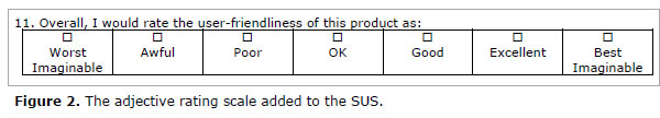
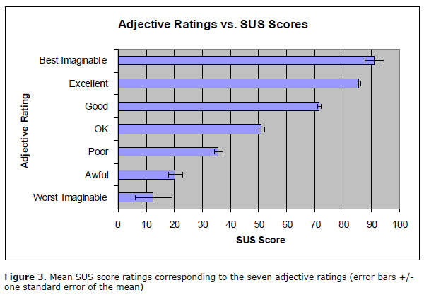
But even better, our three authors analyzed a final, single question added to 959 of their recent SUS questionnaires. Participants picked one of these adjectives after answering the SUS questions.
Here's how the SUS scores matched the adjectives (all graphics come from the study publication):
So now you have some adjectives to include in your report. You can give the score, and this chart shows you which adjective matches the score.
Do it yourself, too; and make the grade
Better yet, include the adjectives with your own SUS questionnaire. Let your participants give you an overall evaluation directly. See how closely your average SUS results match the chart given above.
Which leads us to how you can give a "grade" to your design.
Our three authors make a speculation. It goes like this.
The traditional school grading scale uses numeric scores that represent the percentage a student has earned out of the total possible score. Remember?
A score of 70% to 79% on a test got you a "C". A score of 80 % to 89% got you a "B" and a score of 90% or more got you an "A". (You never got a "D" or an "F", right?)
See what our authors propose in the context of matching their adjective results with a proposed "grading vocabulary". Does it make sense to you? It sure makes sense to me.
Extending your SUS scores to "loyalty"
Recall our second goal for usability metrics: to determine "how well our web design encourages visitors to come back to our site". This refers to site "loyalty".
For this we turn to another active web researcher, Jeff Sauro, magi of www.measuringusability.com. Sauro (2009) recently published in his newsletter the results of his study somewhat similar to the adjective study above.
Sauro examined SUS data from 146 participants tested in a dozen venues such as rental car companies, financial applications, and websites like Amazon.com.
In addition to the usual SUS queries, test participants got one extra question: "How likely are you to recommend this product to a friend or colleague?"
This extra question, turns out, has quite a pedigree. It gives a "Net Promoter Score" (NPS). Some authors report this one question offers good prediction of long term growth for a company.
Upon correlating scores from the NPS with overall results of the SUS, Sauro found that the SUS explains about 36% of the variability in the Net Promoter Scores.
He points out that people identified as a "Promoter" have an average SUS score of 82 (plus or minus about five points). So, if you want your web site to serve as a beacon for loyal customers ("promoters"), strive for an SUS score above 80.
Recall that earlier in this article, an SUS score of 80 gets a "B" reflecting roughly the midpoint between the adjective phrases "Good" and "Excellent" (see Figure 3 above).
So making the grade of "B" also gets you some customer loyalty. Not bad.
SUS-tainability: the gist of it all
Here are a few points to help you attain SUS at-one-ment.
- The SUS questionnaire offers you a standard measurement tool for assessing your designs.
- You can compare your results against results from other usability tests using adjectives like OK, Good, Excellent, and Best Imaginable.
- You can assign a letter grade to your test results and share that with your colleagues.
- You can even say your web site promotes loyalty (return visits) for participants who score above 80. (My November, 2009 HFI Newsletter about "cognitive lock-in" gives further evidence on usability as the missing link to customer loyalty.)
- The SUS questionnaire has no fees. You may use it freely.
- It's short, sweet, quick, and (not so) dirty! (See Tullis and Stetson, 2004, if you have absolutely any doubts about this.)
Check out the references below for details. I've used the SUS many times. It helps you communicate to any client the overall subjective response of usability test participants.
If user experience is important to you, then the SUS gives voice to the experience of your users.
References
Bangor, Aaron, Kortun, Philip, and Miller, James, 2009. Determining What Individual SUS Scores Mean: Adding an Adjective Rating Scale. Journal of Usability Studies, 4 (3) May 2009, 114-123.
Brooke, John, 1996. SUS: A "quick and dirty" usability scale. In P. W. Jordan, B. Thomas, B. A. Weerdmeester, & I. L. McClelland (Eds.), Usability evaluation in industry (pp. 189–194). London: Taylor & Francis.
Sauro, Jeff, 2009. Does better usability increase customer loyalty? The Net Promoter Score and the System Usability Scale (SUS). 7 Jan 2010.
Sorflaten, John, 2009. Wherefore Art Thou O Usability? – Cognitive lock-in to the rescue. HFI Newsletter, Nov, 2009.
Tullis, T. S. & Stetson, J. N. (2004, June 7-11). A Comparison of Questionnaires for Assessing Website Usability, Usability Professionals Association (UPA) 2004 Conference, Minneapolis, USA.
Tullis, T. S. & Albert, B. (2008, May 28). Tips and Tricks for Measuring the User Experience. Usability and User Experience 2008 UPA-Boston's Seventh Annual Mini UPA Conference, Boston, USA.
Message from the CEO, Dr. Eric Schaffer — The Pragmatic Ergonomist

Normally I like to use more extensive surveys and scorecards so that I can get a bit more diagnostic power. But I agree that the venerable SUS still has a place. There is nothing quite like a score to help motivate.
Leave a comment here
Reader comments
Mary M. Couse
Government of Canada
If you run SUS as an online survey, how do you ensure that you get a representative sampling? How do you know that the results would not be skewed by a preponderance of responses from disgruntled or thrilled users?
Ken Gaylin
AT&T
Thanks very much. That last UI Design Newsletter (January 2010) regarding the SUS was great. I will try to use it as soon as an opportunity arises.
Gabe Biller
I don't know much about metrics around usability or UX, and I'm trying to use the SUS scale for the first time right now. My question: Does using a 7-pt Likert scale instead of a 5-pt one make a big difference in the "results"?
J. Femia
Opto 22
I must be missing something here. Since half the questions are negative and half positive, a score of 80 would indicate the respondent is very ambivalent about the product, not that it's a good product. If I love the product and "strongly agree" with questions 1, 3, 5, 7, and 9 (score 25), then I will "strongly disagree" with questions 2, 4, 6, 8, and 10 (score 5; total SUS score 30). I'd get the same score if I hated the product and reversed my answers. Would you please explain? Thanks.
Joshua Scott
U.S. Army
Thanks again for the valuable info by using that 11th question. Just to let you know, i used the previous test results as a baseline of usability (63%) and ran another survey using only 2 question (part of the appeal). After conducting the survey with two questions - one asking to rate usability and another optional open ended question asking how we can make the site better - i was able to conclude, we increased usability by 10% after the redesign.
Sergey Sinyakov, CUA, CXA
SUS definitely did not loose its relevance. It is quite easy to run the test itself but a bit more complicated to analyze the data. Recently we developed an online tool that we called SUS+, because in addition to traditional SUS questions it included an option for calculating NPS (Net Promoter Score). Here are couple of demo links of how it works. The first one is a participants’ page and the second is a stripped-down version of the analytic tools
Jeff Zee
Pretty good article, but alas, the author falls into the common trap of interpreting the SUS as an objective measure of usability. He starts off correctly by asking, “Would you like to get a baseline questionnaire measure of subjective “ease of use ” on the original design?” but then slips later by asking, “Do you need a score of 50 (out of 100) to say that a product is usable, or do you need a score of 75 or 100?”
The SUS cannot tell you whether a product is usable or not – it can only tell you how users subjectively perceive it. Anyone who has ever run a usability study knows that perception and reality are often not the same (users don't realize they made errors, etc.). Bangor, et al., point this out in their article. This misunderstanding of what the SUS is and does leads individuals to make unfounded conclusions such as the commenter above who claims to have “increased usability by 10%.” Lastly, to address one of the commenter questions above, calculating the SUS is not a straightforward process of simply adding the individual scores together. The negative scales have their scores reversed and all scales are converted to a 0-4 scale. There are calculators out there that allow you to simply plug in your raw scores to calculate the overall score.
Subscribe
Sign up to get our Newsletter delivered straight to your inbox