Cool stuff and UX resources
In the Pleistocene era there were no breadcrumbs...
In the last decade, we have seen some important changes in the way that users behave on the Web. We know now that on information pages, users will scroll. We also know that 3 clicks to service is not required, as long as the navigation path accurately reflects and reinforces the user's information model. We have learned that if designed from the interaction perspective, rollover menus can be usable. (Designers still struggle with this last one.) This evolution may reflect the fact that users now have more exposure to the web and are more familiar with how it works. Alternatively, this could reflect that descriptions of user behavior in the browser environment is becoming more sophisticated. Or maybe it's a bit of both.
There are some things, however, that users simply do not seem prepared to learn on their own. Multiple-select interactions is one of those things. Breadcrumb navigation is another.
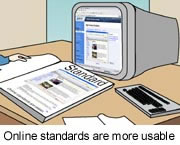
Derived from Hansel and Gretel (Rogers & Chaparro, 2003), breadcrumb navigation provides users a persistent shortcut to find their way "home" on a Web site. Specifically, breadcrumbs are a secondary form of navigation (see figure below) that, in some cases, provide users the decision path they took to arrive at that page. In other cases, breadcrumbs reveal the hierarchical path showing the present page in relation to the information architecture of the site. (Users, by the way, tend to assume that the breadcrumb trail reflects the former, or their decision path.)
The resistance to using breadcrumbs is perplexing. They increase efficiency. They support site learning. They reduce the user's "where-was-I?" memory burden by providing a list of recently visited pages. They make it easier to cross levels of the navigation decision tree within the browser environment.
Breadcrumbs make site learning and navigation more efficient. And it's the designer's job to enhance efficiency, right? So we continue to design sites with breadcrumbs.
But breadcrumbs are only beneficial if users notice them. And largely, they don't. Or maybe they do and they are telling us something.

Ann Landers says you can't change people
Actually, breadcrumbs are not helpful in every environment. When a user arrives at a site knowing exactly what they want (e.g., I want to buy the book called, "How to think straight about Psychology"), breadcrumb navigation (or for that matter browser navigation) is not all that efficient. For these guided, tactical-strike tasks, users tend to use search. And search tends to work (Spool, 2002).
However, when the task involves one or more browse/ compare/ select sequences (e.g., "Buy a snow boarding shell" as opposed to "Buy the North Face Gully Shell"), studies demonstrate that breadcrumb use increases efficiency (Maldonodo and Resnick, 2002; Bowler, Ng & Schwartz, 2001).
But users don't use breadcrumbs spontaneously. Studies show that, too.
Not surprisingly, the picture is not so black and white. Super users DO use breadcrumbs. You do, don't you? And you use them because they are efficient. They make sense.
This difference explains why users' reluctance to exploit breadcrumbs presents such an affront to the sensibilities of designers. Such an affront, in fact, that studies now seek to describe both contexts in which users might exploit breadcrumbs and also how to get users to change: Lazar and Eisenbrey (2000) report findings that indicate that the first step in making breadcrumb trails useful is to train users that they exist. They can be trained, right? After all, users have learned to scroll.
A recent paper by Hull, Chaparro and Halcomb (2004) builds on this approach, seeking to identify how much instruction is necessary to teach users to see and use breadcrumbs. Within their study, they asked participants to find and select a list of items (related to a camping trip) on a major retail site. Before setting a participant loose on the site, they presented her one of 3 levels of instruction about navigation:
- No instruction
- Modeled exposure to breadcrumb navigation with no verbal instruction (what they refer to as "mere exposure" a la Zojanc (1968)1
- Modeled exposure to breadcrumb navigation accompanied by explicit instructions to use breadcrumb navigation
The explicit instructions group used breadcrumbs to navigate approximately 1/3 more than other groups. This seemingly small increase in use of breadcrumbs to move around resulted in significantly faster task completion, fewer visited pages and less reliance on the back button.
Hull and colleagues conclude that minimal training may be sufficient to get users to increase their use of breadcrumbs and, as such, increase their task efficiency. Specifically, they argue that training makes sense in Intranet environments, where the ROI for the training would be more than offset by increased productivity.
Still, the idea that users need to be trained should be a red flag. And the idea of providing training to public Web site users is not viable. Maybe these users are telling us something about breadcrumbs. Another job of designers is to hear the users, right?
Making things more efficient may be one goal for designers, but listening to (and hearing) the users is a larger goal.
Don't break the back button
Executing the business goals through good design is an even more primary goal. Taken from that perspective, efficiency of task completion may not be the holy grail in e-tail environments. In bricks-and-mortar retail environments, being exposed to something increases your likelihood of buying it. Think candy in the supermarket checkout aisle. Further, the longer you browse, the more you are likely to buy. It is reasonable to believe that these same effects hold in on-line environments.
To that end, successful e-tailers do everything they can facilitate browsing. Think Amazon. Amazon is one of those environments—or the original books/music store was, at least—where users often know exactly what they want, to conduct a strategic search and leave. Amazon's designers know that. And they go to great (and successful!) lengths to offset that tendency and encourage browsing to combat it.
Still, there is an art to this kind of salesmanship. Customers need to feel they are in control of their purchasing experience. Providing a tour guide, as Amazon does, can be ok. After all, I can ignore him. However, the hard sell doesn't work: Remember the break-the-back-button strategy? The idea was if you break the back button, people will stay longer. If they stay longer they will see more pages. If they see more pages (even if they are only trying to escape), eventually something will catch their eye and they will buy. It's interesting logic...derived directly from mall architecture ("I can see the Starbucks, but can we get to it?")...it just didn't work. Frustrating users doesn't sell things. Don't break the back button.
Chasing the wrong rainbow...
Let's go back again to Hull, Chaparro and Halcomb (2004). In their study, they used a reasonably well organized retail site to test their hypothesis. Their participants that used the breadcrumbs finished the task more quickly than those who used traditional navigation (including the back button). They also traversed significantly fewer pages along the way. They were more efficient, but are you beginning to see why that may not be the right goal? The converse question is the key question: Were the participants that completed the tasks more slowly less satisfied with their experience?
No. In fact, there were no reliable differences in user satisfaction levels between the three groups. Increasing the use of breadcrumbs as navigation shortcuts did not improve the experience. Traversing more pages did not frustrate the users.
So here's what we have to work with:
- Breadcrumbs increase efficiency in browse/compare/select environments by reducing browsing
- Exploiting breadcrumbs did not meaningfully improve the user experience
- Users have to be cajoled (er, trained) to using breadcrumb navigation2
- Users who browse more products tend to buy more things.
Maybe the users are telling us something. And maybe we should listen.
Footnotes
1. In an overly simplified nutshell, Zajonc's (1968) "mere exposure" effect describes another of the shortcut that humans take to shortcut algorithmic logic. We tend to favor things that we are more familiar with. Familiarity, here, is very loosely defined. So simply being exposed to something ("mere exposure) can increase our familiarity with it, and thereby influence our liking. Clearly, this effect is exploited in advertising. It has also been used to explain phenomena like why people (really do!) more frequently marry the girl/boy next door, why name recognition is more important than platform or behavior in elections and why "knowns" can feel safer than "unknowns".
2. Incidentally, anecdotal and proprietary studies suggest that it's not breadcrumbs but their visual design and placement that mitigates use: Users note design elements that are highly salient/important (e.g., global navigation), highly visible or is in the area they are looking at on the screen. And when the breadcrumb navigation trail is visible and presented where the user is looking, users tend to exploit them more.
New Directions in HCI
References
Bowler, D., Ng, W., and Schwartz, P. (2001). Navigation bars for hierarchical websites. Retrieved 01/20/03 from University of Maryland, Student HCI Online Research.
Hull, S.S., Chaparro, B.S., & Halcomb, C.G. (2004). The Influence of Mere Exposure on Web Based Breadcrumb Navigation, Human Factors and Ergonomics Society 48th Annual Meeting, 1552-1556.
Lazar, N., & Eisenbrey, M. (2000). Website structural navigation. Retrieved April 29, 2003, from University of Maryland, Student HCI Online Research.
Maldonado, C. A. & Resnick, M.L. (2002). Do common user interface design patterns improve navigation? Proceedings of the Human Factors and Ergonomics Society 46th Annual Meeting, 1315-1319.
Rogers, B.L. & Chaparro, B.S.(2003). Breadcrumb Navigation: Further Investigation of Usage, Usability News, 5.2.
Spool, J. (2002), In search of the perfect search: Building the perfect on-site search, CHI 2002 Tutorial.
Zajonc, R. B. (1968). Attitudinal effects of mere exposure. Journal of Personality and Social Psychology Monographs, 9(2, Pt. 2).
Message from the CEO, Dr. Eric Schaffer — The Pragmatic Ergonomist

I can't see the effort in training users on breadcrumbs to gain a 1/3 increase in usage—it just makes no sense. Instead I think I will reserve breadcrumbs for hierarchically organized sites with a lot of expert users. Otherwise it does not seem like they are worth the clutter.
Leave a comment here
Subscribe
Sign up to get our Newsletter delivered straight to your inbox