Cool stuff and UX resources

Intuitive Haptic Icons: The Next Gadget in Your UX Designer’s Tool Belt?
Introduction
There’s one thing I’ve noticed in the 15+ years I’ve been practicing user-centered design and leading User Experience (UX) teams: one of the best ways to judge the experience of a User Experience practitioner is to assess the number and variety of the design solutions, or “tools,” they have available in their personal UX “tool belt.” Usability problems come in many shapes and sizes, and the solutions need to be equally varied – seasoned UX professionals don’t often fall into the trap of thinking just because they’ve mastered a standard set of design “hammers,” that every usability problem they see is a “nail.”
This being said, most of us User Interface (UI) designers have spent our whole careers using visual tools to solve usability problems. Some of us have branched out to audio tools too, but the other human senses are rarely considered part of our practice. However, recent research involving haptic, or touch, -based interfaces have given the UX community new insights into how tactile “tools” can be used to solve a number of emerging usability issues in situations where visual and audio interfaces may fall short. Now is the time for well-rounded UI designers to consider adding haptic “tools” to their UX “tool belts.”
Haptic interfaces are nothing new. In fact, one of the first haptic interfaces was introduced in 1829 by Louis Braille. Braille devised an alphabet of characters consisting of physically raised dots that the blind, who lack access to a visual UI, could use to read. Video games have used vibrating controls to simulate explosions and crashes for decades and, more recently, most smartphones and tablets come with tiny motors that allow applications to “vibrate” the device when a visual or auditory cue is not appropriate. These uses of haptic feedback have not been optimal – they have either required extensive training, as is the case with Braille, or were used as a simply binary (either “on” or “off” state) cues, requiring the user to reference another interface, usually visual, to get the meaning of the vibration.
In the past few years, however, cutting edge UI designers have begun to see a different, more expansive role for haptic feedback. Recent research seems to show that using haptic feedback may not always require extensive training or complementary visual and audio feedback. In a 2013 study at the University of Tampere, Finland, researchers found that haptic feedback can be used in more than a binary fashion, using a variety of vibration patterns, called “vibrotactile icons,” to convey richer information to the user and, in some cases, completely substitute for visual and auditory feedback.
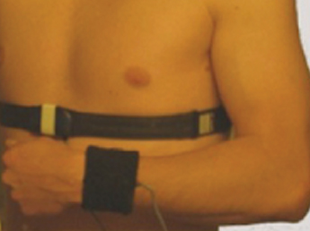
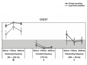
In this research 24 participants were split up, with half receiving training on the meaning of three different vibration patterns; one for “speeding up,” one for “stay at their pace,” and one for “slowing down.” The other half were not trained at all. All the participants were fitted with vibration devices on both their chest and wrists. Then both the groups of participants were asked to do exercises and use the haptic stimuli to guide their pace.
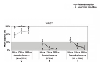
The trained participants interpreted the haptic stimuli correctly 88-100% of the time, whereas the untrained participants were correct 71-83%, and the researchers concluded: “As the unprimed participants performed similarly to the primed participants, the results suggest that vibrotactile stimulation can be intuitively understood.” In other words, it’s possible “vibrotactile icons” could convey more than just an “on” or “off” state and that haptic feedback can be understood by most users “out of the box” – without training.
Implications
UI designers must now consider haptic “icons” when faced with design challenges on UIs for devices that either have or could provide vibrotactile feedback. This additional design tool is already showing up in cutting-edge product and application designs. One excellent example comes from automaker General Motors, who has created a haptic interface for their latest version of their premium Cadillac line. Dubbed the “Safety Seat Alert,” the driver’s seat generates vibrating pulse patterns on the left and/or right side of the lower bolster to alert the driver of potential dangers, such as drifting from a traffic lane or toward nearby objects while parking. Threats from the front and rear trigger pulses on both sides of the seat. “It’s akin to someone tapping on your shoulder in a crowd to get your attention,” said General Motors Active Safety Technical Fellow Raymond Kiefer. “Using the tactile sense to communicate crash threat direction provides an effective and intuitive way to cut through the clutter of visual and auditory sensory information that drivers routinely experience.”
When should designers consider using haptic icons? Here are few user challenges that may indicate their use:
- Environmental – noisy environments where the user is distracted from any visual alarm or can’t hear an audio alert (trading floor)
- Multitasking – situations where the user may already be at the limits of their visual and/or audio attention capacity (auto seat)
- Privacy – users sometimes would prefer if certain kinds of information were not shared with everyone else around them - haptic icons can be private (health monitoring)
- Realism – haptic feedback can be used to mimic the real world (games and simulators)
What design considerations go with haptic icons? Here are some best practices to consider:
- Longer is better – In the University of Tampere study, the participants were more accurate when given a longer lasting stimulus
- Find the right stimulus point – participants’ reaction time was quicker with wrist stimuli than with chest stimuli
- Match stimulus intensity to the usage scenarios – some environments or use contexts may require more or less vibration intensity than others – for example, a user running on a treadmill may require more intensity than a user sitting in an office
- The tactile experience matters too – some tactile stimulus can be perceived in a negative way – for instance, females reported the chest stimulation to be “unpleasant” – and there may be significant differences in the ways that different users perceive tactile icons due to their physical or contextual attributes.
Experimenting with tactile icons is fairly easy.
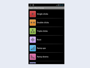
For Android smartphone users, there is a “Haptic Effect Preview” app available for free from a company called Immersion, which also sells a developer’s library of code to enable haptic icons within Android apps.
For iPhone users, the latest iOS allows you to customize the haptic icon associated with each of the entries in your contact list – try setting separate vibration patterns for your boss and your spouse or significant other and see if you can use the haptic icon you created to select which call to pick up during your next business meeting!
Haptic Effect Preview App for Android
References
-
Lylykangas, J., Surakka, V., Rantala, J., and Raisamo, R. 2013. Intuitiveness of vibrotactile speed regulation cues. ACM Trans. Appl. Percept. 10, 4, Article 24 (October 2013), 15 pages
Immersion Corporation Apps from Google Play
Download Haptic Effect Preview app from Google Play
Mactrust.com: “How to Create Custom Vibration Alerts in iOS 7”; December 30, 2013
Message from the CEO, Dr. Eric Schaffer — The Pragmatic Ergonomist

I’m just now adding “vibrotactile icons” to my tool belt. I remember adding a vibrating alert to an industrial beeper in 1977. We did that because the users were in factories and often wearing ear protection. There was just no choice. But now we can envision crafting richer experiences with vibration, texture, smell, heat, etc. It is opening a much wider pallet for the UX practitioner.
The demonstrated vibrotactile icon recognition rates are impressive, far exceeding many studies of visual icon self-evidency. But of course the context and number of choices was limited in the study. What will be interesting now is to see what international population stereotypes emerge. To become facile with this new tool we will need to carefully watch which vibrations people come to expect.
Leave a comment here
Subscribe
Sign up to get our Newsletter delivered straight to your inbox