
The Paradoxical Paradox of Choice! Should we provide users with more or fewer options?
Introduction
We all value our opportunities to determine the direction of our lives and those of our families, don’t we? Who we marry, what (if any) religion we adopt, our healthcare, what schools to send our children to, what restaurant to eat at on Saturday, even our sexual orientation. These are freedoms Western societies have increasingly cherished throughout the 20th and now into the 21st Century. The conventional wisdom has been that as society matures, becomes wealthier and offers more choices to its citizens, we all become happier. In any event, we largely take choice for granted, perhaps forgetting that our quite recent ancestors may have been offered very limited choice in any of these areas.
That wisdom has been challenged in recent decades, perhaps most compellingly by Barry Schwartz in his bestselling book The Paradox of Choicel Why More is Less. Schwartz argues that we are now overwhelmed by a bewildering array of choices in our lives. He illustrates this with examples such as supermarkets offering 285 varieties of cookies, 6.5 million combinations for choosing a stereo at a local electronics store, potentially life or death healthcare choices patients are now expected to make, whether we choose to be at work or at leisure (given the way we can always remain connected with the office) and mobile phones that you can do thousands of things with. Choice, he says, can be paralyzing as well as liberating, citing experimental and experiential evidence that too many options mean that people are less likely to select any of them. He argues that more simplicity in our lives may, in many circumstances, be a good thing.
Conversely, there are strong arguments in the other direction…also backed up by evidence. If, indeed, we are paralyzed by too much choice, why do supermarkets, electronics stores, Indian restaurants, bars and so many other retail outlets and websites make such a virtue of the great array of varieties they supply? Perhaps, in the modern world, we actually need to have an array of choices if we are to be able or willing to make purchasing decisions.
This matters rather a lot to UX professionals and their clients, of course. It matters to usability specialists because we make design decisions impacting on the complexity of interactions and associated choices we expect our users to make. But it matters most in the field of Persuasion, Emotion and Trust (PET). Here we design for how to get users to make the decisions we’d like them to make as they interact with our systems, especially in e-commerce where a wide range of products may be available.
Let’s take a look at some of the research evidence.
Evidence that fewer options are better
Philosophers and scientists have been concerned with “search overload” for centuries. The 14th Century French philosopher and monk Jean Buridan speculated that a donkey might procrastinate when choosing between two equally tempting piles of hay and then starve because it failed to decide. The 20th Century psychologist Miller found that relinquishing an attractive option for another choice may lead to procrastination and conflict. But, more recently, an especially compelling body of research shed new light on the idea that people can be overloaded with too many choices. This was the work of Iyengar and Lepper (2000) who, in a now classic experiment, demonstrated this problem with an assortment of jams in a famous deli store.

Early 20th Century cartoon referencing “Buridan’s donkey” to lampoon US Government procrastination in choosing the route for the Panama Canal
Draeger’s grocery store near Stanford University prided itself (and still does) on the sheer range of products it offered, with busloads of shoppers and sightseers turning up to look at what was on display and, ideally, to make purchases from the huge array of options available. But did this huge array increase the likelihood of shoppers actually buying? The researchers did an in-store experiment to find out. They set up a tasting table with exotic jams, giving a $1-off coupon to those who approached the table. In one condition six jams were offered and in the other, 24. Perhaps unsurprisingly, they found that the 24-jam condition made a bigger initial splash; more people approached. The surprising finding however was that, when it came to actually making a purchase of at least one jam, 30% of those who approached in the 6-jam condition did so, whereas a mere 3% actually bought in the 24-jam condition. More choices meant less purchasing. Striking evidence for the Paradox of Choice!
In another experiment, the same researchers investigated the effects of the number of options in choosing from an array of luxury chocolates. More options meant more enjoyment in choosing, but less satisfaction with the eventual choice. Other researchers have found similar results with pens, gift boxes and coffee.
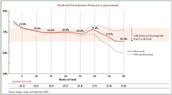
In quite different areas, Iyengar and Lepper have shown that search overload occurs in the quality of written essays, which decreased with the more topics the students had to choose from, and in selecting pension plans, where the more plans offered, the less the likelihood of actual participation in the pension plan.
QED, when it comes to making purchasing or other decisions, providing too many choices is a bad thing. But is it that simple?
Evidence that more options are better
Well, the answer is: no, it’s not that simple! There are strong arguments in favor of providing plenty of choice, some backed up by good science. The world of retail generally believes this and there is evidence that retailers who offer more choice have a competitive advantage. Providing a large assortment, simultaneously or in one place, means that purchasers don’t need to put so much work into choosing from different locations at different times, can make better direct comparisons and get a better feel for the overall distribution of quality across what’s available.
And, as persuasion engineers, we recognize that people make decisions by comparing between several options. Hence the power of the decoy strategy, in which we might deliberately put an expensive product alongside a comparable, cheaper one, to encourage the purchase of the latter, or an obviously unattractive option alongside a more attractive one for the same reason (Dan Ariely writes engagingly about this “power of relativity” (sometimes referred to as the Contrast Principle or Contrast Effect) in his books on human irrationality).
So what would happen in the extreme case where we were offered no choice at all—just a single option? Would we then be unable or less likely to make purchase decisions? “Single-Option Aversion” is investigated in a series of experiments, published in 2013, by Daniel Mochon at Tulane University in New Orleans. His work shows that people are much less likely to make purchase decisions when only one option is made available than when there are at least two. He concludes that there’s something “psychologically unique about being presented with a single option which increases consumers’ propensity to search.” So, if you want to stop people feeling they must look for more options after they’ve already been attracted to something you are offering, give them a sensible range of potentially attractive options simultaneously, not one at a time and certainly not just a single choice.
Evidence that it depends on a whole range of factors
In a 2010 paper, Scheibehenne, Greifeneder and Todd investigated evidence for and against choice overload, conducting a meta-analytic review of around 50 different studies in this area. They discovered that there was a mean effect across all of the studies of virtually zero. In other words there’s about equal evidence, from the research, in favor of either position. It seems that it depends on a range of factors, especially the complexity of the choices available and the individual’s knowledge of the domain in which choices are required.
So where does this leave UX practitioners?
As UX practitioners we need to recognize the psychological biases that occur around choice in the way that we design for usability and persuasion. In particular, we need to guard against the Paradox of Choice on the one hand, ensuring users are not faced with bewildering choices, and against Single Option Aversion on the other, so they are offered enough options to enable clear choice comparisons. Plainly, investigating factors associated with how users make choices needs to be a key part of user research.
Here are five design guidelines:
- Limit the number of options. If users are to make decisions in a complex and possibly unfamiliar domain, for example selecting insurance or financial products, design ways of narrowing the options to those that are both clearly distinct and relevant to users.
- Make it easy to compare options. Because users decide through comparing between more than one option and will want to search further if not enough choice is offered, present a range of contrasting options in a way that makes comparison easy. If there is a choice you want to encourage your users to take, you can use a decoy strategy, such as placing obviously very expensive or otherwise less attractive options close to the ones you’d really like them to choose.
- Provide option “bundles.” Package related products together in ways that make sense, thereby limiting the number of decisions users need to make for themselves. Examples might be package holidays (transportation, accommodation, excursions, etc. ), meal deals (starter and main, plus drink, etc.), or hi-fi systems (CD player, amplifier, speakers, leads, etc.). The experts have done the hard work in defining the bundles, leaving users with easy to make “bundle-level” decisions.
- Provide faceted navigation and/or filters. Make complex choices easier by letting users respond to a limited number of choice dimensions, or facets. In the banking domain, for example, users may find it difficult to select precisely which of thirty or more different loan products would best meet their needs, but easy to specify their income, loan duration, purpose and amount they need to borrow. That might narrow the option set down to, say, three or four relevant products from which they can easily choose. Conduct user research to discover the right facets for your target audiences, however, and don’t make the mistake of defining complicated facets that require decisions that are even more daunting than choosing between the wide range of products you are offering.
- Design for progressive disclosure. Decidophobia is less likely to be an issue for domain experts, who will expect a broad range of options and will be happy to use their own expertise when making decisions. So keep choices simple for the non-expert, but provide advanced features supporting more complex choices for users who know all about the domain.
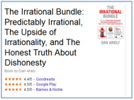
Dan Ariely and his publishers have “bundled” related books together, perhaps to make buying all three an easier decision to make.
The number of guidelines is limited to just five for obvious reasons!
References
- Ariely, Dan. 2010. Predictably irrational: the hidden forces that shape our decisions. New York: Harper Perennial.
- Iyengar, Sheena S., Gur Huberman, and Wei Jiang (2004), “How Much Choice Is Too Much? Contributions to 401(k) Retirement Plans,” in Pension Design and Structure: New Lessons from Behavioral Finance, ed. Olivia S. Mitchell and Steve Utkus, Oxford: Oxford University Press, 83–95
- Iyengar, Sheena S. and Mark R. Lepper (2000), “When Choice Is Demotivating: Can One Desire Too Much of a Good Thing?” Journal of Personality and Social Psychology, 79 (6), 995–1006.
- Mochon, Daniel (2013), “Single Option Aversion” Journal of Consumer Research, 40 555-566
- Scheibehenne, Benjamin, Greifeneder, Rainer and Todd, Peter M (2010), “Can There Ever be Too Many Options? A Meta-Analytic Review of Choice Overload” Journal of Consumer Research, 37 409-425
- Schwartz, Barry (2004), The Paradox of Choice: Why More Is Less, New York: HarperCollins.
Message from the CEO, Dr. Eric Schaffer — The Pragmatic Ergonomist

This is a great alert to the complexity of persuasion engineering. We have principles, and conflicting principles, and limits on the application of those principles. That is why you need to know the persuasion tools, but also take time to focus them and fine tune your designs. To do this we must know what we are designing for. Is the user’s task effectively selecting an item, or luxuriating in the decision process? And even then there are certainly limits. Baskin-Robbins might be best not going beyond their 31 flavors of ice cream.
Leave a comment here
Subscribe
Sign up to get our Newsletter delivered straight to your inbox