Cool stuff and UX resources

Using the Goldilocks Principle to get design "just right"
Introduction
Remember Goldilocks? She's the fairytale girl who visited the three bears' home in the woods, trying out their chairs, beds and then porridge in groups of three. The first chair or bed or bowl of porridge was just too big, hard, or hot. The second was too small, soft, or cold. But the third was, well, "just right".
When researching this on Wikipedia I was amazed to learn there is a "Goldilocks Principle".
(I also learned that our planet is called a "Goldilocks planet".Our planet Earth falls "just right" – for example, Earth is neither too far from the sun nor too close to the sun. The Earth's distance to the sun is "just right" for supporting life, our jobs and our mortgages. It all works out.)
Now, how often have you proposed a design that you thought was, well, "great". But your buddy thought differently: "not so great".
Can we apply the Goldilocks Principle to tweak the design so that it's "just right"?
You bet. Let's see how using the Goldilocks Principle benefits us more than plain old usability testing.

Overcoming test anxiety
OK – just how good do you feel about testing as a tool for iterating your designs?
If you're like me, testing designs can be a bit like asking somebody out for a date. What if I get rejected? Dark thoughts intrude...
And I'm sure when you finish each design you just "know" it's going to work. But what if it doesn't?
This process of testing while designing is called "formative testing". We test while still "forming" our approach to solving the design problem. This contrasts with "summative testing" that we conduct on our finished product.
And that's the point. With formative testing, we need to remember that we really have not completed our design until we test it, iterate, and test again.
This attitude takes us out of the dating metaphor where dark thoughts can hamstring our efforts to move forward with creative alternatives.
Instead, we move into the Goldilocks Principle as our guide to design practice. With the Goldilocks Principle, we test in order to get it "just right." The Goldilocks Principle can replace the judgmental attitude that is often associated with testing.
Let's see how the Goldilocks Principle can apply to testing aesthetic design decisions.

Figure 1. Example stimuli from Experiment 1. Shown are the benchmark image (left) used for comparison and one of the 27 test images (right) rated by the participants.

Figure 2. Example from experiment 2. Participants compared the aesthetic appeal of 27 layouts (such as on the right) with the single benchmark (on the left – with a score of "10"). If the layout on the right appeared twice as appealing, it got a score of "20".
Aesthetic evaluation and the Goldilocks Principle
Two University of Michigan researchers, Michael Bauerly and Yili Liu wondered how to design layouts on web pages to maximize the "aesthetic preference". They varied two important components of layouts: symmetry and the number of compositional elements.
In their first experiment, they used black squares on a white background and asked their 16 participants to compare each of 27 designs to a "benchmark" design (on the left). The benchmark design got an arbitrary score of "10".
If a participant felt the design on the right was twice as appealing, then it got a score of 20. If it was considered half as appealing, it got a score of 5. The authors called this a "magnitude estimation method" – not a bad technique for usability testing.
I will report their results from their second experiment, a replication of what we just saw, but with images created to look like Web page screenshots.
Before we continue, make a guess regarding how many elements (on the right) participants would tolerate before giving the design a lower aesthetic appeal – 3? 5? 7?
Or, are they equal in appeal?
Getting it "just right"
For the Web page images, our researchers found that "symmetry" had much less effect on aesthetic appeal than did the number of images. When the number of images exceeded 5, then the ratings of aesthetic appeal decreased in a statistically significant manner.
What was your prediction? Whether it was right or "wrong" does it now seem reasonable that like Goldilocks, trying out a variety of solutions may be your best bet to getting it "just right"?
Put briefly, there are some things you just cannot reasonably predict! So try them out and measure the response. The "magnitude estimation method" has strong inherent logic. That's one method to start with.
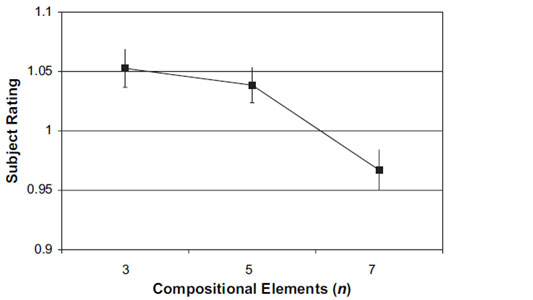
Figure 3. For experiment 2, participants rated Web page designs with 7 images lower in aesthetic appeal than designs with either 3 or 5 images.
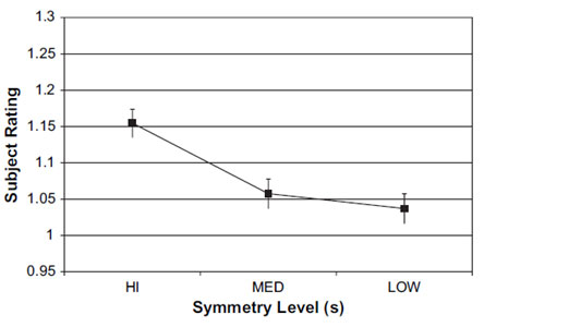
Figure 4. Experiment 1, without any text surrounding the images, participants gave higher ratings to layouts with greater symmetry.
More Goldilocks results from experiment 1
When presented with a more abstract design (without any words in the designs), Bauerly and Liu found that "symmetry" did indeed have an effect on subject ratings. They found that high symmetry received higher ratings as in this chart.
Could we have predicted this based on any prior experience? Probably not. In fact, this finding did not show up in Experiment 2 that used simulations of Web pages.
Now, you may never have "blank" backgrounds as in this Experiment 1. However, it is reasonable that your "background" elements are unique.
What's the moral here? Use the Goldilocks Principle: test, iterate, and test until "it's just right".
Let Goldilocks solve the problem of "wicked design"
In a sense, the design issues of symmetry and number of elements discussed above might be considered "grade school" problems for usability.
We get the idea very rapidly that we can generate solutions and try them out using measurements like the "magnitude estimation method" described above.
But what about that $4 million project for designing a new breakthrough killer-app your company needs in order to beat the competition for the next 2 years? And you have 6 months to do it.
To what degree can we stay with our old definition of iteration? Namely, can we live with "see how well it works, then make it better"? Some people call this the "tame problem" of design.
Let's look briefly at a case study of an IBM project, reported in 2006 by Wolf, Rode, Sussman and Kellog. They faced what they call a "creative design" problem (the wicked problem) versus our more typical "engineering design" problem (the tame problem).
In short, they define the "wicked problem" of creative design, as design that...
"is about understanding the problem as much as the resulting artifact. Creative design work is seen as a tight interplay between problem setting and problem solving. In this interplay, the design space is explored through the creation of many parallel ideas and concepts. The given assumptions regarding the problem are questioned on all levels. Creative design work is inherently unpredictable. Hence, the designer plays a personal role in the process." (My italics.)
The take-away here, again, is reframing our goals from "passing the test" to "getting it just right". So, we're back to the Goldilocks Principle as a guide to the toughest challenges of designs.
What are some methods that support the "wicked problem" of design? The quartet of authors suggest the following. (I recommend you skim their article for greater understanding of their profound points...)
1. Adopt a non-linear process of intent and discovery
Abandon hope for a linear, premeditated path of reasoning to solutions. Replace that with pragmatic assessment of the activities you conduct in order to invent and gain consensus.
Goldilocks tried out the bed, the chair and the porridge, because she was tired, wanted to sit at the table, and was hungry. She was a pragmatist.
2. Invoke design judgment – a combination of knowledge, reflection, practice, and action
Where do leaps of creativity come from? They come from occasional abandonment of prior ideas of scientific validity. Instead of rigid adherence to method, the authors say "the designer practices the design process on behalf of the user in order to bring about purposeful change and meaning".
Goldilocks took a leap of faith when breaking into the bears' home. She had no idea who lived there. Her intrusion became the basis of new relationships and survival.
3. Make artifacts
Proof then comes from drawings, prototypes, and sketches that validate your design and "gain acceptance" of your solution among others.
Goldilocks was driven by curiosity. She had instincts for what was useful and had good reasons for checking out the bed, the chair, and the food.
4. Conduct design critiques
Conversation with peers who are versed in the field of your inquiry brings insight, accountability and opportunities to validate or restructure your direction and method. Include users and stakeholders, as well.
Without the three bears as conversational partners, Goldilocks would have missed the significance of her explorations. She made social inroads by talking to the bears!
Trust but verify...
We have toured a world of design issues. The Goldilocks Principle offers a new catchphrase that may embolden you and your colleagues to see your usability work in a new light.
I hope that is the case.
For the record, did our IBM authors ignore the iterative design and testing method? No, they didn't. They remind us that "user-centered design embodies aspects of both creative and engineering design... There is a place in computer human interaction for iterative development, with its prototypes and testing."
I suggest this advice tells us to "trust" our intuition but "verify" the outcomes in the case of "wicked" design problems.
Iterate but verify...
In the case of the "tame" design problems, we must still tread lightly to avoid rash conclusions.
As an example, I'll mention that the Bauerly and Liu study (above) was replicated by Liu and three colleagues at the Beijing Institute of Technology in China. (Yes, this is a cross-cultural test of the effects of symmetry and the number of page elements).
This test replicated the condition using the "blank" background while using black squares (Experiment 1 of Bauerly and Liu).
The results with Chinese participants replicated the American findings regarding a general preference for symmetry. However, the Chinese results also showed that a larger number of elements did not decrease the aesthetic appeal. Pages with 7 elements had the same aesthetic appeal ratings as groups of 5 and 3.
This contrasts with the American findings that showed pages with 7 elements tended to reduce the aesthetic ratings. The American study concluded this was probably due to the greater "density" or "complexity" of the design.
The China study concluded that Chinese users were less sensitive to the complexity of the interface than American users.
So much for generalizations. Remember "Iterate but Verify".
The Goldilocks Principle
Remember what Goldilocks said after testing the extremes of hot and cold, tall and short, soft and hard? She said: "This is just right".
How did she earn the right to say that?
She tried different things that made sense to her.
This is the Goldilocks Principle.
Go, build, try, and see whether it is just right.
References
Bauerly, M. and Liu, Y, 2008. Effects of symmetry and number of compositional elements on interface and design aesthetics. International Journal of Human-Computer Interaction, 24(3), 275-287.
Bi, L., Fan, X., Zhang, G., Liu, Y., and Chen, Z. 2009. Effects of symmetry and number of compositional elements on Chinese users' aesthetic ratings of interfaces. International Journal of Human-Computer Interaction, accepted for publication.
Goldilocks Principle. Downloaded 29 July, 2010 from Wikipedia.
Wolf, T.V., Rode, J.A., Sussman, J., and Kellogg, W.A. 2006. "Dispelling design as the "Black Art" of CHI," Proceedings of CH, 2006 Conference (Montreal, Quebec, Canada, 22-27 April).
Message from the CEO, Dr. Eric Schaffer — The Pragmatic Ergonomist

We can take incremental walks through design choices in order to find the nice "tame" best design. But increasingly we need the very different processes to create and refine disruptive "wicked" design problems.
I think we are seeing our field drawn to do more wicked work as companies stretch for those BIG ideas. In these times of exponential change the corporate strategy of being a "fast follower" just won't do.
Leave a comment here
Reader comments
Speider
Schneidersweb
An interesting and informative article on the emotion responses on the part of users, but as a designer, I have to point out that more often than not, testing is never done and design and usability is determined by the client and staff members, leading to the term, "design-by-committee."
If you remember the story, Goldilocks broke into a house, vandalized the place, stole food and ended up fleeing the scene of the crime and is still at large to this day.
Stan Lindstone
Nice to try to coin a term "formative testing" but basically in an iterative user-centered design process, testing during the design is just testing. Would we need now to coin the final usability test of a product "informative but futile testing"?
Subscribe
Sign up to get our Newsletter delivered straight to your inbox