Cool stuff and UX resources

Where is a good chart when you need it?
Introduction
Remember the Challenger O-ring debacle? On 28 January, 1986 NASA managers had to decide if the circular rubber rings used to join sections of the orbital spaceship could perform. Unusually cold for the Florida launch pad, temperatures had dipped to about 28 degrees Fahrenheit (-2 degrees Celsius). Pretty cold for rubber O-rings that must flex to work.
In a teleconference, engineers at Morton Thiokol recommended against launch. They said they had no performance data at temperatures below 53 degrees Fahrenheit (11.7 degrees Celsius).
However, after NASA expressed frustration at any delays, Morton Thiokol's management asked for a break to discuss the issues among themselves.
Congressional Hearings explored that internal discussion (I added the italics):
Chairman Rogers: Did anybody [within Morton Thiokol] take issue with you?
Mr. Boisjoly: Well, I am coming to that. I also showed a chart of the joint with an exaggerated cross section to show the seal lifted off, which has been shown to everybody. I was asked, yes, at that point in time I was asked to quantify my concerns, and I said I couldn't. I couldn't quantify it. I had no data to quantify it, but I did say I knew that it was away from goodness in the current data base.
History (and congressional testimony) showed that Morton Thiokol management felt pressured to say "yes" to liftoff. In justification for that decision, management concluded that their engineers had no proof that the flight would fail.
(Engineers agreed this logic itself was flawed. Instead, they should have been asked to show proof that the flight would succeed.)
After the break, Morton Thiokol management told NASA that their design would handle the temperature. NASA launched, and Challenger exploded within 73 seconds of launch.
Question to you: As a web designer, familiar with graphical communication, could anyone have shown Morton Thiokol management a chart to make clear that cold temperatures posed great danger to the launch?
Charts-at-a-glance
Edward Tufte, a well-know Yale statistician and visual design professor addressed this O-ring decision problem in his book Visual Explanations: Images and Quantities, Evidence and Narrative, p. 44.
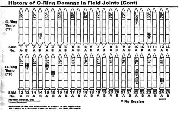
For example, Morton Thiokol had this chart to show the relationship between temperature and O-ring failure. Does it work for you? (Temperatures are vertical, O-ring problems are squiggles. Two pictures per launch analysis.)
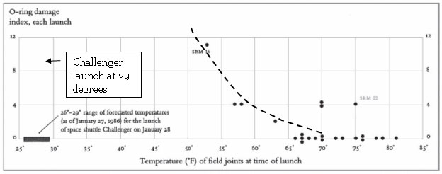
To clarify the relationship of temperature and O-ring damage, Tufte's solution used just two dimensions (horizontal and vertical). As the temperature gets lower (to the left), the measure of damage to O-rings goes UP. (I added the dashed line.)
Check out the farthest left column. It shows the 29 degree temperatures for the Challenger launch. Clearly, the temperature on Jan 28, 1986 had a strong relationship with higher O-ring damage. This visualization shows that O-ring damage increases with colder temperatures and would support a decision to abort the mission.
The potential and the challenge
As designers, how can we support Web-based decision making?
Two marketing professors, Nicholas Lurie and Charlotte Mason look at a number of innovative visualization tools found on the web. They characterize potential benefits. But more importantly, they give warnings about unintended consequences of your design decisions.
They identify five areas where visualization supports decision making. The vocabulary alone will help you talk the talk with your management.
Download the article for interesting tips beyond what we list here.
Visual Perspective (how the end-user relates to the visual information)
1. Interactivity (how the end-user participates in the experience)
2. Depth of field (your design can give "overview" or "details" or "both")
Information Context (which information the end-user attends to)
3. Vividness (some colors and shapes naturally stand out – but do they hinder judgments?)
4. Evaluability (your design influences what data gets evaluated and compared)
5. Framing (your approach may bias the end-user's solution)
1. Interactivity – It's just plain fun (and pays off in sales)
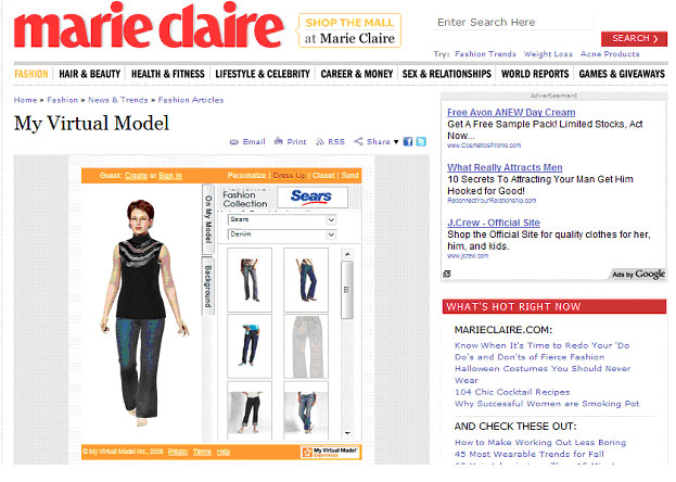
What's good about letting customers interact with a "virtual model"? You get to put clothes on a graphic figure – you can even pick the body build. Check out this virtual fashion model for starters. (Search on "virtual model" for other sites.)
The authors report research by other investigators to show the value of "interactivity". For example, when the Land's End clothing site implemented a virtual model, conversion rates increased 34% and the average order value increased 8% (2004). When Restoration Hardware enabled viewers to change details of furniture color and fabric choice, conversion rates doubled (2005). Are you interested in interactive visualization, now?
Lurie and Mason cite research that suggests people make better decisions and make them more easily, when the tools match their normal tasks. This is the case when you "put the clothes on" the virtual model. And the model can look like you, as well. In contexts other than clothing, simulations allow better decisions. The authors conclude: those "using interactive visualization tools will be more likely to consider multiple factors." It also increases confidence in the decision.
2. Depth of field – Keeping perspective with breadth + depth
We live and breathe through hierarchies. Just take a look at your computer. I bet you used Windows Explorer to find folders within folders and then documents within folders. That's a "tree" diagram. However, can it get unwieldy with large amounts of nested data? You bet. Just try drilling down into Microsoft Explorer and try to keep track of where you are. Research verifies this difficulty.
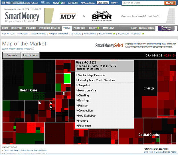
Another method called "Treemaps" provides both the overview and detail view simultaneously. The screenshot below covers about 500 stocks across various sectors. Each stock is a rectangle. The size represents market capitalization. Green color indicates rising prices; red color indicates decliners. Dark colors mean prices stay neutral.
I clicked on the only green rectangle in the "Financial" group and you can see that it was Visa card. Guess I'll sell that and take my profits :) Note that we are seeing the market sectors (the overview) and details (rising and declining stocks) simultaneously to aid our decision-making.
Our authors, Lurie and Mason, suggest that this Money Market implementation of treemapping helps consumers make better decisions. Seeing the context of industry sector performance while evaluating details of stock picks beats using traditional single-stock line graphs.
3. Vividness – Lipstick works. But is that all you want?
Graphics have greater power than text. To a designer, this is a no-brainer. However, to managers, you may need some evidence of this power.
For example, in an advertising context, a 1991 study showed that graphic information overpowered adjacent text on an unrelated topic. A 1997 study showed that viewers rate risk higher with a graphic presentation of that risk compared to numeric cost information presented in text. Graphics are more vivid, and thus get results.
Another example involves schematic faces (sophisticated smileys). A 1986 study found that readers give extra importance to eyes and mouths regardless of the meaning coded by the different types of eyes and mouths. Eyes and mouths are more "vivid".
Orientation of a graphic also gets attention. For example, a 1987 study demonstrated that certain angles "jump-out" more than other angles: 0 degrees, 90 degrees, and 180 degrees simply get more attention. Thus, when using pie charts, these proportions (a "quarter pie" = 90 degrees) may get more favorable response from an audience than other proportions in the presentation. These proportions are simply more "vivid" – like lipstick.
Our authors suggest that decision makers may overestimate the frequency or probability of information that is more vivid. Can this be a problem? You bet.
4. Evaluability – Is what you see really what you saw?
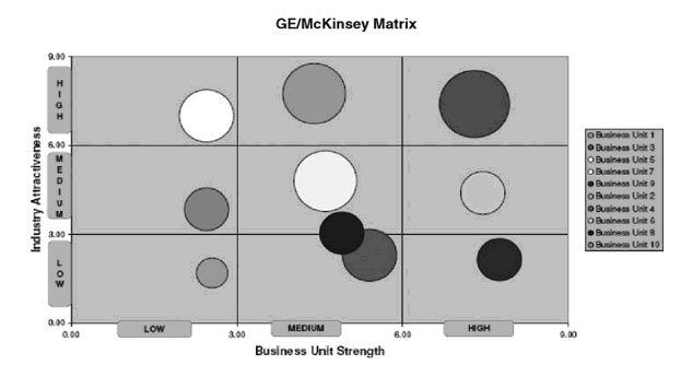
Look at the chart below. The area of each circle reflects the comparative market size of the Business Unit it represents.
On the one hand, this presentation allows you to quickly evaluate and find Business Units that are strong (on the right) as well as belong to an attractive industry (top row). You can do this more efficiently with this chart than with a table of numbers. On the other hand, you may fail to appreciate that the top-rightmost business unit is considerably larger than the top middle unit. Research as early as 1965 identified a "size effect" that creates a bias for decision makers.
Viewers will tend to underestimate the differences between larger and smaller circles. Solution? Add numbers that show market size. For example, each circle could have market size labels like $11.5 (million). This improves "evaluability".
Other research shows that charts should be compatible with the task. If, indeed, the user is expected to compare market size, then a bar chart would be better than an area graph (circles).
Research shows that more radical techniques can assist combining information for decisions. A study from 1996 showed that both novices and experts processed multiple financial variables more quickly using schematic faces ("smileys") than when using financial ratios or accounting statements. The smiley/frowsy faces enhanced "evaluability".
5. Framing – First impressions set the stage
Web users have many lists to work with. How often do you change the order of your list to help you make a choice? This is "framing": changing the presentation of the decision problem. But can this sort order create a "bias" in your final choice? The answer is "yes".
Even subtle cues like the order of a list from high to low can "anchor" the end-user with the higher value as the comparison point. A study from 2002 showed that a list of sales from highest to lowest led to higher estimates of overall sales than a list sorted from low to high. This happens because readers place greater weight on their initial information – the high sales estimates.
The classical case of "framing" involves comparing the attractiveness of products using positive statements versus negative statements involving the same amounts. In 1988, a study showed that people felt much better about purchasing ground beef that was "75% lean" when compared with beef is framed as "25% fat". These are the same thing, just presented with different frames.
The case for skillful visualization
We don't need to sell ourselves on visualization tools. We intuitively appreciate the benefits they bring for speeding up tasks, seeing correlations, outliers and trends. Visualization helps us compare size, features, colors, and shapes.
Visualization lets us do these things faster, cheaper and more accurately. Visualization can offer a context for combining many variables into a single glance – and we can have new insights.
On the other hand, drawbacks exist. End-users may focus too much on outliers rather than the core data. Or, attractive, but overly-detailed views may lead to incorrect conclusions from only a portion of the data. Or use of area and volume to make comparisons may lead to inaccurate perceptions because end-users have difficulty with these.
As designers, we have an obligation to understand these shortcomings. Understanding this gives the freedom to develop other visualization tools that unleash the intuitive skills of our end-users.
Visualization Tools
In addition to the tools mentioned above, the authors give URLS for advanced visualization tools. Here I present updated URLs on those tools.
References
Lurie, Nicholas H & Mason, Charlotte H 2007. Visual representation: implications for decision making. Journal of Marketing 71, (Jan), 160-177.
Message from the CEO, Dr. Eric Schaffer — The Pragmatic Ergonomist

Data visualization should be a part of every UX design team’s tool kit. It can provide decision support for an executive’s applications. It can also make it easier for customer support staff to understand a plan and communicate it fluently.
Data visualization can also be emotionally persuasive and memorable for customers. And you can use it to emphasize different viewpoints (ok, that's lying with statistics). But this is NOT universally covered by HCI programs. In fact, you may need to have visual communication specialists to get it right.
Leave a comment here
Reader comments
Marc Schluper
Interactivity is what gives the details in your Treemap (Depth of field) example. Interactivity supports evaluability - additional information can be given on request.
In his classes Tufte emphasizes that information comes to life when people can explore it, and discover what's most interesting to them. Here, too, interactivity is key.
Evan Rolek
Do we always need data to make a decision? As the sign on the wall in Albert Einstein's office read... "Things that can be counted don't always count. And things that count can't always be counted." Perhaps the high level folks at NASA and a few other places need to read that sign?
Ann Pinion
Challenger was not a "debacle", it was a tragedy. No chart will substitute for management's lack of backbone.
Having said that, yes, there is a huge difference between data and information. Showing people data does not substitute for giving them information.
Subscribe
Sign up to get our Newsletter delivered straight to your inbox