- About us
- Contact us: +1.641.472.4480, hfi@humanfactors.com
Cool stuff and UX resources

"User Experience" meets "Beauty is Truth, Truth is Beauty"
Introduction
What was on your Santa's list for your usability career? A new book on CSS? Learning more about SEO? Or maybe some tips on convincing management that user experience input really does make a difference to your business?
Since we need a raison d'être before meriting other items on Santa's list, let's consider how to make user experience an "indispensable service." Yup, this article is a pep talk from your coach.
After all, prophets really should be well-regarded even in their own home town. You're the prophet. Your job is the home town. Shouldn't your institution find value in your services?
Three psychology professors propose evidence and a theory that links how people define beauty and truth with their user experience. Will that sell in your home institution?
In short, the research trio, Rolf Reber, Norbert Schwarz, and Piotr Winkielman, suggest that intuitive judgments of both "truth" and "beauty" gain support when people can do something faster. This is because faster implies "simpler". And "simpler" implies both truth and beauty.
Let's see how we could lay out this argument to others who question our contributions.

"Simpler" means "Processing Fluency"
We'll get into all the ways of making things simpler in a minute. But first, let's hear what the authors say regarding how to tie it all together.
The main issue turns on what people define as "beauty" or "preference" or "liking". How many times have you heard colleagues say "that's a beautiful picture" or "that's a beautiful solution" or "that's a beautiful way of doing it"?
The word "beauty" seems to imply there is some characteristic within the object or web page design, or task design that makes it aesthetically pleasing. The authors call this the objectivist view. Much research has gone on in the past to define elements of art, design, and scientific simplicity to define elements that contribute to "beauty".
Meanwhile, as we all know, an extra-terrestrial alien may have different concepts of physical beauty than we earthlings. We can easily understand that Star Trek's Lieutenant Worf, a Klingon played by Michael Dorn, would have different criteria for a Miss Universe winner than would, say, William Shatner's Captain Kirk.
This understanding suggests that "beauty is in the eye of the beholder", as our authors say. This becomes the subjectivist view and probably remains a source of contention as your colleagues subjectively argue about which page design or graphic element really IS more beautiful (or useful).
But, as our authors point out, anyone who makes aesthetic judgments brings with them a processing background of habits, preferences, and conditioned responses that color their aesthetic judgments.
Therefore our authors adopt a third position, calling it the interactionist view. They suggest that beauty gets defined in how people "experience" the objective elements using their subjective cognitive and affective processes.
"Easy to use " means "Processing Fluency"
Well, does this sound familiar? This interactionist view focuses on the experience of the viewer – and that's our professional expertise: "user experience".
Our authors show evidence that the user experience associated most with identifying both truth and beauty tends to be the "fluency" with which someone can process an object. Now you have some buzz words: "processing fluency". Use these buzz words over and over until your audience can process them fluently. :)
Thus, "easier" becomes "better" or "I like it" or "more beautiful". The authors present study results that support processing fluency as a reason for saying "judgments of preference, liking, and beauty are closely related."
Thus, the interaction approach allows us to say that when a viewer experiences a web page that is easy to process or understand, they get a good feeling about their experience. This good feeling contributes to calling the web page a "beautiful design". That's "interaction" experience.
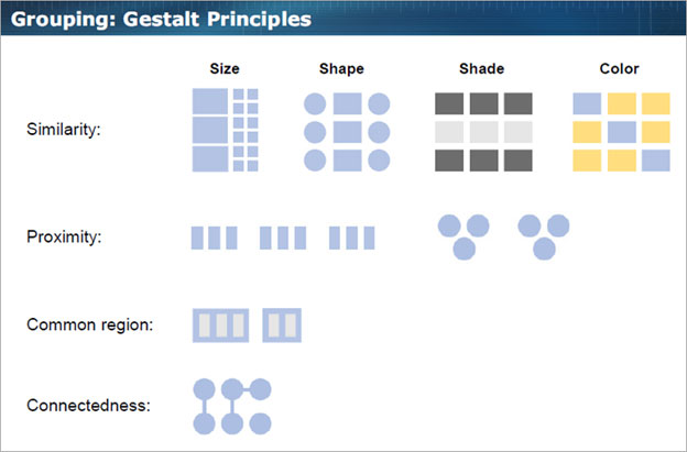
Figure 1. Gestalt patterns that simplify the visual appearance of clusters of elements.

Figure 2. Use of Similarity, Proximity and Common Region to create a satisfying Gestalt that speeds up visual processing fluency.
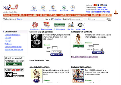
Figure 3. Example in which the absence of a clear Gestalt results in cluttered layout. The viewing work to ferret out the meaning of the details takes more time than otherwise expected. The reduction in processing fluency translates to the subjective experience of cluttered design or information overload.
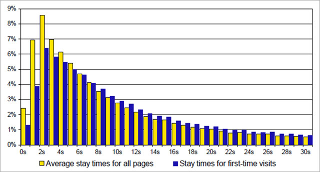
Figure 4. From Weinreich, et al. Results of page visit times for 25 European web users over mean period of 105 days web usage.
Fluency from objective features of your design
1. Gestalt. "Simplicity is king."
The study of "Gestalt psychology" was an early version of research into processing fluency. We all know that to "get the Gestalt" of something means to grok the meaning quickly. Of course, I'm substituting one jargon for another.
But "getting the Gestalt" means comprehending the wholeness of something in a manner that makes it easier to understand. "Gestalt" has come to mean "simplicity". In a sense simplicity arises from having less information to distract the viewer. "Less information" means processing it faster. "Faster" means greater fluency. In this manner, "fluency" results from creating a "wholeness" or "gestalt".
The HFI Web and Applications Design course covers techniques for enhancing the Gestalt of your web page layout. Techniques like "Similarity", "Proximity", "Common Region" and "Connectedness" allow you to combine smaller elements together in a simple form that keeps your viewer comfortable. Contrast the two web pages following to see whether your ability to process each one gives a feeling of "beauty" or "liking".
2. Symmetry. "When left is also right."
Research shows that people tend to have a faster reaction speed when processing visual stimuli that have particular forms of symmetry. For example, the letters "V" and "A" are symmetrical around a vertical axis. In contrast, the letters "E" and "D" are symmetrical around a horizontal axis. Reaction time studies show that participants detect vertical symmetry faster and more easily than horizontal symmetry. This suggests that your web pages and images would benefit from vertical symmetry more than horizontal symmetry.
Other research finds that symmetry adds to the perceived attractiveness of human faces. Given the duplication of left and right (or top and bottom), "symmetry" by definition has less information to process. These results with symmetry suggest that perceptual fluency operates to speed up processing, thus offering a more pleasant experience that the viewer will call "attractiveness" or "likable" or "beautiful", as the case may be.
3. Contrast and clarity. "Faster is better."
What speeds up recognition of a figure in a picture? While your personal experience already tells you, research also confirms that stronger foreground-background contrast results in higher appeal ratings. For example, participants were asked to view circles in a presentation that varied the contrast between the figure and the background. They gave judgments regarding how "pretty" the stimuli were or how "ugly" they were.
The notion of "processing fluency" suggests that presentations of short duration would manifest a greater range of aesthetic judgments across the varied contrasts because higher contrast would help facilitate processing during very short viewing times. Indeed, this was the case. The circles were presented for .3 seconds, one, three, and 10 seconds with varied contrasts. The authors report that "figure-ground contrast influenced aesthetic judgments only at short exposure durations, but not at the duration of 10 sec."
How much time do people spend looking at your web page upon first visit? Recall our September, 2009 UI Design Newsletter "Harnessing Your Power of First Impression". This newsletter shows the power of "priming" under short exposure conditions. (Priming turns out to be another tool for enhancing perceptual fluency.)
We can add to our knowledge of site visit times the results from a 2006 report by Weinreich, Obendor, Herder and Mayer. They gathered page visit data from 25 European professional-types who used the web for an average of 105 days each during the study.
Among web pages visited for the first time by participants, the authors found that "more than 17% of all new pages were still visited for less than 4 seconds, nearly 50% were shown for less than 12 seconds and 11.6% were displayed for more than 2 minutes (median: 12.4s)."
Thus, with about 17% of new page visits being 3 seconds or less you could infer that your important text and images should stand out from the background to help speed up processing fluency. Your site visitor will interpret this faster processing as the experience of beautiful design when compared to other pages with less figure-ground contrast.
Fluency from subjective features of your design
1. Repetition works. "Play it again, Sam."
Much research over the last 40 years has investigated the claim that "mere exposure" over time will result in more favorable evaluations. This has been shown to hold for exposure to faces (consider "movie stars"), words (consider political sound bites), melodies (yes, think top-10 music) as well as other experimental oddities.
Robert Zajonc, whose research made this observation popular, suggested that the mere exposure effect helped reduce the "fear of the unknown". The authors of our current study suggest that this reduction of uncertainty enables more rapid processing and thus increases perceptual fluency leading towards the sense of beauty, liking, and preference.
For user experience specialists like ourselves, we now can justify the value of layout standards. A page should look like other pages within a site with regard to the grid or columnar structure. The navigation should repeat a standard "look".
Position, color, font, style, and length of important elements on pages within a site benefit from standardization because each page then "looks familiar" and adds to the effects of mere exposure. The site visitor's comfort that "I've been here before" has empirical value because it speeds up processing fluency.
2. Expectations count. "I'm not surprised."
Research into how a situation matches the user's expectations shows that preferences increase when participants feel they are in familiar territory. For example, researchers would make up an artificial "grammar" of sets of letters and show them to research participants who became familiar with the patterns of letters.
Subsequently, participants were shown both grammatical and ungrammatical sets of letters and asked to indicate how well they liked each set they saw. Interestingly, even in this artificial situation, the degree of "liking" of the sets of letters or in another experiment, complex visual patterns, was related to the degree of similarity to the standard that participants had learned.
The researchers attributed the degree of "liking" to the degree of fluency in recalling the items on which they had been trained. When the new items failed to match their expectations, it was liked less. It was harder to recognize. It lacked fluency.
In our design work, we all know the value of "style". It conveys the visual attributes we hope that establish the emotional values of "brand" for our service or product. If we sell trucks, we want a style that suggests power, ruggedness, versatility and survival. If we sell sedans, we want a style that suggests family, flexibility, comfort, and safety.
These elements of style must remain consistent within the pages that cover our topic. We need to match expectations for style and avoid "surprises".
Conclusions: Your foundation for user experiences
We have seen that "beauty" (or "liking" or "preference") results from the interaction of objective characteristics with subjective predilections. This interactive approach to aesthetic appreciation allows you to speak more intelligently about "user experience".
That is, the "beauty" of your design work is not only a component of the design, but also a component of the background, experience, and prior visual exposure of your site visitor.
All these issues come within your domain as a user-experience specialist. These are all reasons that we can't just "design" and put it out into the public. We need to hear from the subjective portion of the aesthetic event – the participant, the site visitor.
Therefore, we need procedures like interviews, contextual inquiry, and usability testing to bring into play this other half of the aesthetic experience.
Hopefully, you have evidence from this study that motivates you to convince your colleagues that design is more than just the visuals. Good design must include the user as well.
In our search for simplicity, we have found that the feeling of simplicity arises when we can process our visual or conceptual inputs more rapidly. That's "processing fluency".
Rapid or fluent processing then becomes the common denominator between truth and beauty in that statement by John Keats in his Ode on a Grecian Urn:
Beauty is truth, truth is beauty, that is all
Ye know on earth, and all ye need to know.
References
Reber, Rolf, Schwarz, Norbert, & Winkielman, Piotr, 2004. Processing Fluency and Aesthetic Pleasure: Is Beauty in the Perceiver's Processing Experience? Personality and Social Psychology Review 8, (4), 364-382.
Weinreich, Harald, Obendorf, Hartment, Herder, Eelco, & Mayer, Matthias, 2008. Not Quite the Average: An Empirical Study of Web Use. ACM Transactions on the Web 2 (1).
Message from the CEO, Dr. Eric Schaffer — The Pragmatic Ergonomist

Our field is shifting. We can no longer just attend to task completion speed. We need to attend to the subjective experience that the design creates. What does this mean for us as practitioners? Do we need to become more sensitive and intuitive? I think we do.
To be successful we need to hone our intuition and empathy for users. But we are also called upon to grasp an even wider range of research-based principles. Our field is stretching to be more strategic, more innovative, more persuasive, more cross cultural, and we are now called upon to manage larger scale operations.
Let's step up to that together in 2010.
Leave a comment here
Reader comments
Vikram Chauhan
UTV New Media Ltd
I dig your new year resolution. Don't we all love a good kaleidoscope where science meets art to create beauty. All the best in this coming year with your new resolve, Eric.
Subscribe
Sign up to get our Newsletter delivered straight to your inbox
Privacy policy
Reviewed: 18 Mar 2014
This Privacy Policy governs the manner in which Human Factors International, Inc., an Iowa corporation (“HFI”) collects, uses, maintains and discloses information collected from users (each, a “User”) of its humanfactors.com website and any derivative or affiliated websites on which this Privacy Policy is posted (collectively, the “Website”). HFI reserves the right, at its discretion, to change, modify, add or remove portions of this Privacy Policy at any time by posting such changes to this page. You understand that you have the affirmative obligation to check this Privacy Policy periodically for changes, and you hereby agree to periodically review this Privacy Policy for such changes. The continued use of the Website following the posting of changes to this Privacy Policy constitutes an acceptance of those changes.
Cookies
HFI may use “cookies” or “web beacons” to track how Users use the Website. A cookie is a piece of software that a web server can store on Users’ PCs and use to identify Users should they visit the Website again. Users may adjust their web browser software if they do not wish to accept cookies. To withdraw your consent after accepting a cookie, delete the cookie from your computer.
Privacy
HFI believes that every User should know how it utilizes the information collected from Users. The Website is not directed at children under 13 years of age, and HFI does not knowingly collect personally identifiable information from children under 13 years of age online. Please note that the Website may contain links to other websites. These linked sites may not be operated or controlled by HFI. HFI is not responsible for the privacy practices of these or any other websites, and you access these websites entirely at your own risk. HFI recommends that you review the privacy practices of any other websites that you choose to visit.
HFI is based, and this website is hosted, in the United States of America. If User is from the European Union or other regions of the world with laws governing data collection and use that may differ from U.S. law and User is registering an account on the Website, visiting the Website, purchasing products or services from HFI or the Website, or otherwise using the Website, please note that any personally identifiable information that User provides to HFI will be transferred to the United States. Any such personally identifiable information provided will be processed and stored in the United States by HFI or a service provider acting on its behalf. By providing your personally identifiable information, User hereby specifically and expressly consents to such transfer and processing and the uses and disclosures set forth herein.
In the course of its business, HFI may perform expert reviews, usability testing, and other consulting work where personal privacy is a concern. HFI believes in the importance of protecting personal information, and may use measures to provide this protection, including, but not limited to, using consent forms for participants or “dummy” test data.
The Information HFI Collects
Users browsing the Website without registering an account or affirmatively providing personally identifiable information to HFI do so anonymously. Otherwise, HFI may collect personally identifiable information from Users in a variety of ways. Personally identifiable information may include, without limitation, (i)contact data (such as a User’s name, mailing and e-mail addresses, and phone number); (ii)demographic data (such as a User’s zip code, age and income); (iii) financial information collected to process purchases made from HFI via the Website or otherwise (such as credit card, debit card or other payment information); (iv) other information requested during the account registration process; and (v) other information requested by our service vendors in order to provide their services. If a User communicates with HFI by e-mail or otherwise, posts messages to any forums, completes online forms, surveys or entries or otherwise interacts with or uses the features on the Website, any information provided in such communications may be collected by HFI. HFI may also collect information about how Users use the Website, for example, by tracking the number of unique views received by the pages of the Website, or the domains and IP addresses from which Users originate. While not all of the information that HFI collects from Users is personally identifiable, it may be associated with personally identifiable information that Users provide HFI through the Website or otherwise. HFI may provide ways that the User can opt out of receiving certain information from HFI. If the User opts out of certain services, User information may still be collected for those services to which the User elects to subscribe. For those elected services, this Privacy Policy will apply.
How HFI Uses Information
HFI may use personally identifiable information collected through the Website for the specific purposes for which the information was collected, to process purchases and sales of products or services offered via the Website if any, to contact Users regarding products and services offered by HFI, its parent, subsidiary and other related companies in order to otherwise to enhance Users’ experience with HFI. HFI may also use information collected through the Website for research regarding the effectiveness of the Website and the business planning, marketing, advertising and sales efforts of HFI. HFI does not sell any User information under any circumstances.
Disclosure of Information
HFI may disclose personally identifiable information collected from Users to its parent, subsidiary and other related companies to use the information for the purposes outlined above, as necessary to provide the services offered by HFI and to provide the Website itself, and for the specific purposes for which the information was collected. HFI may disclose personally identifiable information at the request of law enforcement or governmental agencies or in response to subpoenas, court orders or other legal process, to establish, protect or exercise HFI’s legal or other rights or to defend against a legal claim or as otherwise required or allowed by law. HFI may disclose personally identifiable information in order to protect the rights, property or safety of a User or any other person. HFI may disclose personally identifiable information to investigate or prevent a violation by User of any contractual or other relationship with HFI or the perpetration of any illegal or harmful activity. HFI may also disclose aggregate, anonymous data based on information collected from Users to investors and potential partners. Finally, HFI may disclose or transfer personally identifiable information collected from Users in connection with or in contemplation of a sale of its assets or business or a merger, consolidation or other reorganization of its business.
Personal Information as Provided by User
If a User includes such User’s personally identifiable information as part of the User posting to the Website, such information may be made available to any parties using the Website. HFI does not edit or otherwise remove such information from User information before it is posted on the Website. If a User does not wish to have such User’s personally identifiable information made available in this manner, such User must remove any such information before posting. HFI is not liable for any damages caused or incurred due to personally identifiable information made available in the foregoing manners. For example, a User posts on an HFI-administered forum would be considered Personal Information as provided by User and subject to the terms of this section.
Security of Information
Information about Users that is maintained on HFI’s systems or those of its service providers is protected using industry standard security measures. However, no security measures are perfect or impenetrable, and HFI cannot guarantee that the information submitted to, maintained on or transmitted from its systems will be completely secure. HFI is not responsible for the circumvention of any privacy settings or security measures relating to the Website by any Users or third parties.
Correcting, Updating, Accessing or Removing Personal Information
If a User’s personally identifiable information changes, or if a User no longer desires to receive non-account specific information from HFI, HFI will endeavor to provide a way to correct, update and/or remove that User’s previously-provided personal data. This can be done by emailing a request to HFI at hfi@humanfactors.com. Additionally, you may request access to the personally identifiable information as collected by HFI by sending a request to HFI as set forth above. Please note that in certain circumstances, HFI may not be able to completely remove a User’s information from its systems. For example, HFI may retain a User’s personal information for legitimate business purposes, if it may be necessary to prevent fraud or future abuse, for account recovery purposes, if required by law or as retained in HFI’s data backup systems or cached or archived pages. All retained personally identifiable information will continue to be subject to the terms of the Privacy Policy to which the User has previously agreed.
Contacting HFI
If you have any questions or comments about this Privacy Policy, you may contact HFI via any of the following methods:
Human Factors International, Inc.
PO Box 2020
1680 highway 1, STE 3600
Fairfield IA 52556
hfi@humanfactors.com
(800) 242-4480
Terms and Conditions for Public Training Courses
Reviewed: 18 Mar 2014
Cancellation of Course by HFI
HFI reserves the right to cancel any course up to 14 (fourteen) days prior to the first day of the course. Registrants will be promptly notified and will receive a full refund or be transferred to the equivalent class of their choice within a 12-month period. HFI is not responsible for travel expenses or any costs that may be incurred as a result of cancellations.
Cancellation of Course by Participants (All regions except India)
$100 processing fee if cancelling within two weeks of course start date.
Cancellation / Transfer by Participants (India)
4 Pack + Exam registration: Rs. 10,000 per participant processing fee (to be paid by the participant) if cancelling or transferring the course (4 Pack-CUA/CXA) registration before three weeks from the course start date. No refund or carry forward of the course fees if cancelling or transferring the course registration within three weeks before the course start date.
Cancellation / Transfer by Participants (Online Courses)
$100 processing fee if cancelling within two weeks of course start date. No cancellations or refunds less than two weeks prior to the first course start date.
Individual Modules: Rs. 3,000 per participant ‘per module’ processing fee (to be paid by the participant) if cancelling or transferring the course (any Individual HFI course) registration before three weeks from the course start date. No refund or carry forward of the course fees if cancelling or transferring the course registration within three weeks before the course start date.
Exam: Rs. 3,000 per participant processing fee (to be paid by the participant) if cancelling or transferring the pre agreed CUA/CXA exam date before three weeks from the examination date. No refund or carry forward of the exam fees if requesting/cancelling or transferring the CUA/CXA exam within three weeks before the examination date.
No Recording Permitted
There will be no audio or video recording allowed in class. Students who have any disability that might affect their performance in this class are encouraged to speak with the instructor at the beginning of the class.
Course Materials Copyright
The course and training materials and all other handouts provided by HFI during the course are published, copyrighted works proprietary and owned exclusively by HFI. The course participant does not acquire title nor ownership rights in any of these materials. Further the course participant agrees not to reproduce, modify, and/or convert to electronic format (i.e., softcopy) any of the materials received from or provided by HFI. The materials provided in the class are for the sole use of the class participant. HFI does not provide the materials in electronic format to the participants in public or onsite courses.