- About us
- Contact us: +1.641.472.4480, hfi@humanfactors.com
Cool stuff and UX resources
More About Fonts
Tom Tullis and his colleagues (1995) used a proofreading task to evaluate the differences in reading rate between type styles and sizes. They had subjects use Arial, MS Sans Serif, MS Serif and Small Font type styles all at 6, 7, 8, 9 and 10 points. The reading material in this and all of the following studies used a black font on a white background. There was no difference between serif and sans serif fonts; however, the 9-point and 10-point fonts elicited reliably faster performance than the smaller sizes. Subjects preferred the 10-point Arial and MS Sans Serif fonts rather than the MS Serif fonts.
Boyarski, et.al. (1998) at Carnegie Mellon University evaluated the reading speed of people using Georgia (serif), Times New Roman (serif) and Verdana (sans serif) fonts. Georgia and Verdana were specifically designed for reading from a computer monitor. All text was set at 10 points. They used a comprehension task (Tinker Reading Speed Test) rather than a proofreading task. Participants included faculty, staff and graduate students who ranged in age from 20 to 53. The subjects read the text on a 17-inch screen with a resolution of 640x480 pixels. They reported no reliable performance differences in reading speed.
Over the past couple of years, Michael Bernard, Melissa Mills and their colleagues at Wichita State University have conducted a series of studies on font sizes and styles. In their first study (Bernard and Mills, 2000) they evaluated 10-point and 12-point Arial and Times New Roman fonts. They had participants read Encarta passages. The words were presented on 17-inch monitors with a resolution of 1024x768 pixels. The test subjects were asked to read each passage "as accurately and as quickly as possible." As they read, they were to find some randomly placed "substitution words" in each passage (e.g., "fun" replaced "sun"). The researchers reported no reliable differences among the passages in reading speed or in the detection of word errors. However, the 12-point fonts were reliably preferred over the 10-point fonts.
In a second study (Bernard, et.al., 2001a) they used a similar procedure to evaluate three different font sizes (10, 12 and 14-points) used with eight different fonts types:
Serif fonts
- Century Schoolbook
- Courier New
- Georgia
- Times New Roman
Sans serif fonts
- Arial
- Comic Sans
- Tahoma
- Verdana
They found that Arial and Times New Roman were read reliably faster than Courier, Schoolbook and Georgia, and that the 12-point fonts were read reliably faster than the 10-point fonts. All of the fonts except Century Schoolbook were reliably preferred over Times New Roman.
In a more recent study (Bernard, et.al., 2002) they used only 12-point fonts, but extended the number of font styles by adding Goudy Old Style (a serif font) and Agency (a sans serif font) to their original eight font styles. Like in previous studies, participants read 2 to 3 page passages located at a fixed distance from their screens. They found no reliable differences between the major fonts in reading efficiency; however, Arial, Verdana and Comic Sans were reliably preferred.
The studies just discussed used participants that were young or middle-aged. Bernard and his colleagues (2001b) examined font characteristics that could assist older adults when reading from the Web. The older users had an average age of 70, with a range of 62 to 83 years. The study used 15-inch monitors that had a resolution of 800x600 pixels. Again, all of the readers were required to remain 22 inches (56 cm) from the screen. They evaluated 12-point and 14-point versions of Times New Roman, Georgia, Arial and Verdana. All the 14-point fonts produced reliably better reading efficiency, and both of the 14-point san serif fonts were reliably preferred over all four 12-point fonts.
What can we conclude from these studies?
- No Web page fonts should be less than 10-points,
- Optimal reading speed for most adults will be elicited with 12-point fonts (size=3)
- There is probably no reliable difference in reading speed for most adults when viewing common font styles (Arial, Verdana, Georgia, Times New Roman),
- Most users tend to prefer sans serif fonts (Arial, Verdana), and
- Older users will benefit from type sizes that are at least 14-points.
HFI's Typography Expert
There are studies that compare legibility of fonts on screens, and make recommendations based on the results. Dr. Bailey and Dr. Schaffer are right to draw only minimal practical conclusions from the studies. Here's why.
First, the conditions of any given test are guaranteed to be different from the conditions your users will encounter. Font size is not an absolute. Think of it as just a label, much the same as "bold" or "Garamond." This is because:
- Selecting a font size determines the number of pixels at a specified pixel resolution, but the CRT or LCD may be any size. 10 points on a 17" monitor set for 1024 x 768 will be much smaller than 10 points on the same monitor set for 800 x 600 or at 640 x 480 (as in the Carnegie Mellon tests Bob described).
- What does matter is the subtended angle of something you're trying to see. People put their displays at differing distances, depending on the physical setup of their desks, the size of the screen, and what they're doing. In general, the larger the physical display, the farther away people put it. That makes type that would look too big on paper at 12 points look too small on a big CRT.
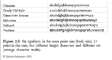
- Point size is not comparable between fonts. Different typefaces may have very different size letters at the same point size. Originally point size was just the height of the metal body of the cast letters (see figures). The point size more directly describes to the normal minimum spacing between lines than to the size of the letters.
The second problem with these experiments is that it's extremely difficult to evaluate any single parameter, because type is a complex, multiple-variable world. For example, if you try to compare the reading speed of 9-point type with that of 10-point type of the same typeface, you will be unable to make everything else be equal. You can decide to hold the number of letters in each line constant, but then the lines will have different lengths, and thus different subtended angles. The eye will have to travel over a wider or narrower line width to read the lines. You could hold the line width constant, but then the number of lines of text required to read the same number of words will be different. Thus, you will be unable to fix the number of eye motions needed to read the text.
Another parameter is leading (space between lines). The optimal leading, needed to optimize reading rate, varies with line length and the size of the type. In your experiment, you have to decide whether to use the optimal leading for the different point sizes.
These problems of confounding parameters appear constantly in trying to determine the legibility of type. Elaborate experiments are necessary to tease out the differences. Tinker and others have done careful work with printed type, and found that there are only small legibility differences between serif and sans serif, but a large penalty for fixed-pitch (typewriter) typefaces. [Tinker, M.A., (1963), Legibility of Print, Ames, Iowa, The Iowa State University Press.]
As to the minimum sizes for text on Web pages, you need to test your results. Fortunately, browsers give users the ability to enlarge (or shrink) fonts to meet their situation. But the browsers and HTML are not very helpful in ensuring that the size you choose will be a good one. This is especially true across platforms: Text that is large enough in IE on a PC may be too small to read in IE on a Macintosh.
I recommend using different fonts, both serif and sans serif, freely to create effective communication. The legibility differences are the smallest effect you have to worry about! Navigation, the quality of what is being read, and page layout matter much more to the effectiveness of software systems. For example, I have done many designs in which I use a sans serif for field labels, and a serif for all variable data. This provides a valuable cue to "parsing" the page, but has an immeasurable effect on legibility. The result is a better design.
Figures © Richard Rubinstein, 2002, reprinted by permission. Dr. Rubinstein is the author of Digital Typography: An Introduction to Type and Composition for Computer System Design, Addison-Wesley, 1988.

References
Bernard, M. and Mills, M. (2000), So what size and type of font should I use on my Web site? Usability News, July, 2(2).
Bernard, M., Mills, M., Peterson, M. and Storrer, K. (2001a), A comparison of popular online fonts: Which is best and when? Usability News, July, 3(2).
Bernard, M., Liao, C. and Mills, M. (2001b), Determining the best online font for older adults, Usability News, January, 3(1).
Bernard, M., Lida, B., Riley, S., Hackler, T. and Janzen, K. (2002), A comparison of popular online fonts: Which size and type is best? Usability News, January, 4(1).
Boyarski, D., Neuwirth, C., Forlizzi, J., and Regli, S.H. (1998), A study of fonts designed for screen display, CHI'98 Conference Proceedings, 87-94.
Tullis, T.S., Boynton, J.L. and Hersh, H. (1995), Readability of fonts in the windows environment, CHI'95 Conference Proceedings - Extended Abstracts, 127-128.
Message from the CEO, Dr. Eric Schaffer — The Pragmatic Ergonomist

It is good to see that fonts and monitor quality are getting good enough to give designers a pretty safe set of choices. BUT, I have some bad news. When we set a font to 10 point in typesetting it is 10/72 inch high. In the Web... we have no clue. The ACTUAL font seen will change with resolution and monitor size! We don't really know what people will see.
What we are in fact doing is setting the minimum HTML font to "10 point". We then have the users adjust their font size by self selecting resolutions and monitors. If that fails they will lean in and squint. So as a designer in typical Web pages can indeed just set fonts at least at 10 points.
If you have a special situation (like a handheld or projection device) you need to make sure people can read the text. To do this measure the distance between the back of the user's eyeball (the fovea) and the display. Divide that distance by 200. That is the minimum character height for good legibility. (In technical jargon, the font should subtend 17 minutes of arc at the fovea.) For example, a distance of 30 inches from the display would require a minimum of 10.8 points. A distance of 20 inches from the eye to a small hand held display would need at least a 7.2 point size.
Leave a comment here
Reader comments
Ann Shaw
Coming from a DTP and WP background, I have become interested in the use of typefaces and have done some work on students' preferences – mostly on paper rather than on screen. Given the choice, there seems to be a wide range of fonts and sizes students say they find easiest to read – some due to real visual problems, but not all. In a recent series of tests Arial 12 gave better comprehension results than TNR or the dreaded Comic Sans. Next step is to test Arial against Verdana and Georgia. I have not been looking at speed of reading though – only at comprehension.
Jeannie Lewis
Although your research above found reading efficiency better with 14 font, and the conclusion said older users would benefit from 14 font, do adults who are not 'older' prefer 14 font to 12 font?
Subscribe
Sign up to get our Newsletter delivered straight to your inbox
Privacy policy
Reviewed: 18 Mar 2014
This Privacy Policy governs the manner in which Human Factors International, Inc., an Iowa corporation (“HFI”) collects, uses, maintains and discloses information collected from users (each, a “User”) of its humanfactors.com website and any derivative or affiliated websites on which this Privacy Policy is posted (collectively, the “Website”). HFI reserves the right, at its discretion, to change, modify, add or remove portions of this Privacy Policy at any time by posting such changes to this page. You understand that you have the affirmative obligation to check this Privacy Policy periodically for changes, and you hereby agree to periodically review this Privacy Policy for such changes. The continued use of the Website following the posting of changes to this Privacy Policy constitutes an acceptance of those changes.
Cookies
HFI may use “cookies” or “web beacons” to track how Users use the Website. A cookie is a piece of software that a web server can store on Users’ PCs and use to identify Users should they visit the Website again. Users may adjust their web browser software if they do not wish to accept cookies. To withdraw your consent after accepting a cookie, delete the cookie from your computer.
Privacy
HFI believes that every User should know how it utilizes the information collected from Users. The Website is not directed at children under 13 years of age, and HFI does not knowingly collect personally identifiable information from children under 13 years of age online. Please note that the Website may contain links to other websites. These linked sites may not be operated or controlled by HFI. HFI is not responsible for the privacy practices of these or any other websites, and you access these websites entirely at your own risk. HFI recommends that you review the privacy practices of any other websites that you choose to visit.
HFI is based, and this website is hosted, in the United States of America. If User is from the European Union or other regions of the world with laws governing data collection and use that may differ from U.S. law and User is registering an account on the Website, visiting the Website, purchasing products or services from HFI or the Website, or otherwise using the Website, please note that any personally identifiable information that User provides to HFI will be transferred to the United States. Any such personally identifiable information provided will be processed and stored in the United States by HFI or a service provider acting on its behalf. By providing your personally identifiable information, User hereby specifically and expressly consents to such transfer and processing and the uses and disclosures set forth herein.
In the course of its business, HFI may perform expert reviews, usability testing, and other consulting work where personal privacy is a concern. HFI believes in the importance of protecting personal information, and may use measures to provide this protection, including, but not limited to, using consent forms for participants or “dummy” test data.
The Information HFI Collects
Users browsing the Website without registering an account or affirmatively providing personally identifiable information to HFI do so anonymously. Otherwise, HFI may collect personally identifiable information from Users in a variety of ways. Personally identifiable information may include, without limitation, (i)contact data (such as a User’s name, mailing and e-mail addresses, and phone number); (ii)demographic data (such as a User’s zip code, age and income); (iii) financial information collected to process purchases made from HFI via the Website or otherwise (such as credit card, debit card or other payment information); (iv) other information requested during the account registration process; and (v) other information requested by our service vendors in order to provide their services. If a User communicates with HFI by e-mail or otherwise, posts messages to any forums, completes online forms, surveys or entries or otherwise interacts with or uses the features on the Website, any information provided in such communications may be collected by HFI. HFI may also collect information about how Users use the Website, for example, by tracking the number of unique views received by the pages of the Website, or the domains and IP addresses from which Users originate. While not all of the information that HFI collects from Users is personally identifiable, it may be associated with personally identifiable information that Users provide HFI through the Website or otherwise. HFI may provide ways that the User can opt out of receiving certain information from HFI. If the User opts out of certain services, User information may still be collected for those services to which the User elects to subscribe. For those elected services, this Privacy Policy will apply.
How HFI Uses Information
HFI may use personally identifiable information collected through the Website for the specific purposes for which the information was collected, to process purchases and sales of products or services offered via the Website if any, to contact Users regarding products and services offered by HFI, its parent, subsidiary and other related companies in order to otherwise to enhance Users’ experience with HFI. HFI may also use information collected through the Website for research regarding the effectiveness of the Website and the business planning, marketing, advertising and sales efforts of HFI. HFI does not sell any User information under any circumstances.
Disclosure of Information
HFI may disclose personally identifiable information collected from Users to its parent, subsidiary and other related companies to use the information for the purposes outlined above, as necessary to provide the services offered by HFI and to provide the Website itself, and for the specific purposes for which the information was collected. HFI may disclose personally identifiable information at the request of law enforcement or governmental agencies or in response to subpoenas, court orders or other legal process, to establish, protect or exercise HFI’s legal or other rights or to defend against a legal claim or as otherwise required or allowed by law. HFI may disclose personally identifiable information in order to protect the rights, property or safety of a User or any other person. HFI may disclose personally identifiable information to investigate or prevent a violation by User of any contractual or other relationship with HFI or the perpetration of any illegal or harmful activity. HFI may also disclose aggregate, anonymous data based on information collected from Users to investors and potential partners. Finally, HFI may disclose or transfer personally identifiable information collected from Users in connection with or in contemplation of a sale of its assets or business or a merger, consolidation or other reorganization of its business.
Personal Information as Provided by User
If a User includes such User’s personally identifiable information as part of the User posting to the Website, such information may be made available to any parties using the Website. HFI does not edit or otherwise remove such information from User information before it is posted on the Website. If a User does not wish to have such User’s personally identifiable information made available in this manner, such User must remove any such information before posting. HFI is not liable for any damages caused or incurred due to personally identifiable information made available in the foregoing manners. For example, a User posts on an HFI-administered forum would be considered Personal Information as provided by User and subject to the terms of this section.
Security of Information
Information about Users that is maintained on HFI’s systems or those of its service providers is protected using industry standard security measures. However, no security measures are perfect or impenetrable, and HFI cannot guarantee that the information submitted to, maintained on or transmitted from its systems will be completely secure. HFI is not responsible for the circumvention of any privacy settings or security measures relating to the Website by any Users or third parties.
Correcting, Updating, Accessing or Removing Personal Information
If a User’s personally identifiable information changes, or if a User no longer desires to receive non-account specific information from HFI, HFI will endeavor to provide a way to correct, update and/or remove that User’s previously-provided personal data. This can be done by emailing a request to HFI at hfi@humanfactors.com. Additionally, you may request access to the personally identifiable information as collected by HFI by sending a request to HFI as set forth above. Please note that in certain circumstances, HFI may not be able to completely remove a User’s information from its systems. For example, HFI may retain a User’s personal information for legitimate business purposes, if it may be necessary to prevent fraud or future abuse, for account recovery purposes, if required by law or as retained in HFI’s data backup systems or cached or archived pages. All retained personally identifiable information will continue to be subject to the terms of the Privacy Policy to which the User has previously agreed.
Contacting HFI
If you have any questions or comments about this Privacy Policy, you may contact HFI via any of the following methods:
Human Factors International, Inc.
PO Box 2020
1680 highway 1, STE 3600
Fairfield IA 52556
hfi@humanfactors.com
(800) 242-4480
Terms and Conditions for Public Training Courses
Reviewed: 18 Mar 2014
Cancellation of Course by HFI
HFI reserves the right to cancel any course up to 14 (fourteen) days prior to the first day of the course. Registrants will be promptly notified and will receive a full refund or be transferred to the equivalent class of their choice within a 12-month period. HFI is not responsible for travel expenses or any costs that may be incurred as a result of cancellations.
Cancellation of Course by Participants (All regions except India)
$100 processing fee if cancelling within two weeks of course start date.
Cancellation / Transfer by Participants (India)
4 Pack + Exam registration: Rs. 10,000 per participant processing fee (to be paid by the participant) if cancelling or transferring the course (4 Pack-CUA/CXA) registration before three weeks from the course start date. No refund or carry forward of the course fees if cancelling or transferring the course registration within three weeks before the course start date.
Cancellation / Transfer by Participants (Online Courses)
$100 processing fee if cancelling within two weeks of course start date. No cancellations or refunds less than two weeks prior to the first course start date.
Individual Modules: Rs. 3,000 per participant ‘per module’ processing fee (to be paid by the participant) if cancelling or transferring the course (any Individual HFI course) registration before three weeks from the course start date. No refund or carry forward of the course fees if cancelling or transferring the course registration within three weeks before the course start date.
Exam: Rs. 3,000 per participant processing fee (to be paid by the participant) if cancelling or transferring the pre agreed CUA/CXA exam date before three weeks from the examination date. No refund or carry forward of the exam fees if requesting/cancelling or transferring the CUA/CXA exam within three weeks before the examination date.
No Recording Permitted
There will be no audio or video recording allowed in class. Students who have any disability that might affect their performance in this class are encouraged to speak with the instructor at the beginning of the class.
Course Materials Copyright
The course and training materials and all other handouts provided by HFI during the course are published, copyrighted works proprietary and owned exclusively by HFI. The course participant does not acquire title nor ownership rights in any of these materials. Further the course participant agrees not to reproduce, modify, and/or convert to electronic format (i.e., softcopy) any of the materials received from or provided by HFI. The materials provided in the class are for the sole use of the class participant. HFI does not provide the materials in electronic format to the participants in public or onsite courses.