- About us
- Contact us: +1.641.472.4480, hfi@humanfactors.com
Cool stuff and UX resources
Introduction
satisfice: verb: decide on and pursue a course of action satisfying the minimum requirements to achieve a goal; "optimization requires processes that are more complex than those needed to merely satisfice"

Benign neglect isn't always benign
We know that good design can change behavior. People impulsively buy more Snickers bars when marketers put them right next to the checkout line.
But is the reverse equally predictive? That is, if we hide the Snickers bars (either intentionally or otherwise) will fewer candy bars get eaten? What happens when designers ignore (or worse, are innocently ignorant of) users tendencies to interact in predictable ways?
When designers are not attentive to subtle design issues, users trip up. Inattentive design feels frustrating because it forces us to try to actively avoid or suppress behaviors that we are hard-wired to do. It's easy to demonstrate that bad visual design undermines task completion. Think about a task that requires you to read and compare data across rows. Now consider what will happen if a well-meaning but inattentive designer uses color to delineate the columns.
Inattentive information design has detrimental effects too. Designers need to consider the differences between viewing content on paper and interacting with content on the Web. Otherwise they force us to wade through and sort out too much information presented too fast in chunks that are too big or organized so that mapping the information to our mental model takes work. This may ultimately affect how deeply users process and encode information.
Why are survey studies always about breakfast food?
Does benign neglect of detailed design go as far as changing behavior? Can design (or inattention to it) influence the decisions users make and the way that they interact within the information space?
Couper, Tourangeau, Conrad and Crawford (2004) propose that it can. Their studies compare the application of what we know about user interactions with paper studies to user interaction with Web surveys.
Web surveys present significant and interesting improvements in survey data collection. We can use automation to present contingent questions only when they are appropriate. We can randomize choices within questions to minimize the primacy effects (found in paper surveys) and recency effects (found on telephone or verbally presented surveys). The Web also presents interactive opportunities that are not available in the paper survey world. But just because we can doesn't always mean we should...
To understand how what we know about paper surveys translates to Web environments, Couper and colleagues have conducted a series of survey studies that demonstrate that choice presentation of interactive surveys can influence the response selection of participants.
In one of their many studies they compared users' response selection when identical forced-choice questions were presented different ways. The different methods of presentation varied both how much information users see from the offset and how much work they need to do to answer the question (i.e. find the snickers bar).
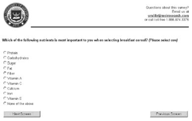
In the Radio-Button condition users were presented all the choices right up front, with a radio button selection interaction, as in Figure 1. In this case, users simply scan the options and indicate the one they select with a single click.
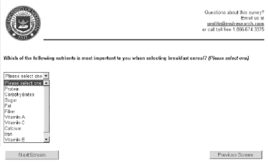
In a Click-to-See-Most condition users were presented the same question, but with a pulldown selection widget. Here respondents need to click to see any of the options. Note that this question style, as is presented in Figure 2, also requires users to also scroll if they are to see the last item in the choice set.
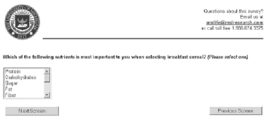
In the Window-to-Five condition, the selection choices were presented via a bounded window. The window presented only five options at a time, so in this condition respondents were required to scroll to see more than half of the choice set.
What they saw...
The findings are interesting.
First they note that respondents tended to pick one of the first options in the first set that they saw. So in the Radio-Button condition (Figure 1) and the Click-to-See-Most (Figure 2), they tended to choose items from throughout the list. By contrast, in the Window-to-Five condition (Figure 3) they tended to pick one of the first five options. This is not surprising. It replicates what we know from paper survey research.
And it's because we satisfice, right? That is, we only go as far as necessary to pick a good answer. We go with that one and move on. Right?
Not really. Couper and colleagues' evidence suggests that we tend to pick one of the first items we see. However, their study is designed well enough to explore why that is happening. This team tucked the "None of the above" option at the bottom of the scroll in both hidden choice conditions. This clever experimental design provided a route to determine whether respondents were satisficing. If they were, we should see more "None of the above" responses for the radio button presentation (Condition 1), since it takes the least work to see that response choice in this condition..
Interestingly, Couper and colleagues' results show clearly that participants did not satisfice. Specifically, the distribution of "None of the above" responses did not differ significantly across the question presentation types.
When satisficing isn't enough
Couper, et. al. have seemingly conflicting results. On the one hand, respondents tended to pick one of the first choices they saw. On the other hand, they are not satisficing.
This team uses a cognitive load explanation to describe the participant behavior. When respondents evaluate a sequence of choices in a selection environment, a few things happen:
- Respondents spend more time thinking about the first options than they spend thinking about later ones
- Their thinking about the first options is clearer. After all, they are juggling less comparisons early in the selection process
- Initial options accumulate more and different evidence with each subsequent comparison. This makes an initial option harder to dislodge against later comparisons.
Put simply, users tend to spend more effort thinking about the first options so they tend to pick them more. The items presented first get a jump start.
Note that this explanation is very different from satisficing. Satisficing suggests that respondents pick early choices because they simply lack the motivation to examine the whole choice set.
Couper and team find that this effect is exacerbated by presentation. Users picked items from the first visible set most often in the Window-to-Five condition.
Do no harm
This study (and others in the works) clearly demonstrate that presentation design not only can, but does influence respondents' choice behavior. The choice of response format in Web surveys can influence the response distribution.
If a respondent is picking a known response from a long list (e.g., their state or salutation title), dropdowns may be fine. However, when the respondent is comparing selection options, hiding data options can shift response patterns. In this case, the behavioral tendency of designers to use dropdowns to save space can be problematic.
References
Couper, M.P., Tourangeau, R., Conrad, F.G. (2004). What They See is What We Get - Response Objects for Web Surveys, Social Science Computer Review 22 (1) pp. 111-127.
Message from the CEO, Dr. Eric Schaffer — The Pragmatic Ergonomist

We have solid evidence that we need to think hard about the interactions we design... RIGHT DOWN TO THE DETAILS OF THE WIDGET LEVEL! Our often casual selection of a control can influence decision making. So we can never again make that selection casual. Sure, the study shows surveys can be biased. But what about ballots... or medical diagnostics?
I have often seen professionals design the high-level navigation for a site, and then leave the detailed page designs to designers without real usability engineering capabilities. If you are one of those... you need to rethink that.
Leave a comment here
Reader comments
Tony Austin
Asia/Pacific Computer Services
Right on! Unfortunately there are tons and tons of poorly designed Web pages (and interactive forms on all sorts of other, non-Web platforms) that suffer because of such poor selection-list design. Little things DO matter, a lot!
Laura Fernandez
Times Group
Yes, we can never again make that selection casual. Sure, the study shows surveys can be biased. But this can be said also in the case of a general opinion topic. But in case a user has to select his education level – he has to anyway go to the right option in the radio button one or in the scroll down window. So there are so many dimensions to design, and each design solution is a unique case altogether and very difficult to standardize.
Marjolijn Verbeek
Capgemini
This article was very useful for me! I am teaching the Usability Essentials and told my class about this new research finding on labels being even more relevant to navigational usability than structure. Thanks for this!!
Michael Bradshaw
Indian Health Service
I found this article very interesting. I have experienced the Window-to-five set-up often in such areas as skills selections on Web sites, as well.
I definitely agree with Dr. Schaffer. The use of a particular presentation method has to be dictated by the user mental model and the data taxonomy (AKA the content model). It seems that some designers simply build a list of data items without thought to categorizing them. The repetition of seemingly identical data points in these instances will cause even more frustration. Thanks for the information and for letting me put in my 2 cents.
Subscribe
Sign up to get our Newsletter delivered straight to your inbox
Privacy policy
Reviewed: 18 Mar 2014
This Privacy Policy governs the manner in which Human Factors International, Inc., an Iowa corporation (“HFI”) collects, uses, maintains and discloses information collected from users (each, a “User”) of its humanfactors.com website and any derivative or affiliated websites on which this Privacy Policy is posted (collectively, the “Website”). HFI reserves the right, at its discretion, to change, modify, add or remove portions of this Privacy Policy at any time by posting such changes to this page. You understand that you have the affirmative obligation to check this Privacy Policy periodically for changes, and you hereby agree to periodically review this Privacy Policy for such changes. The continued use of the Website following the posting of changes to this Privacy Policy constitutes an acceptance of those changes.
Cookies
HFI may use “cookies” or “web beacons” to track how Users use the Website. A cookie is a piece of software that a web server can store on Users’ PCs and use to identify Users should they visit the Website again. Users may adjust their web browser software if they do not wish to accept cookies. To withdraw your consent after accepting a cookie, delete the cookie from your computer.
Privacy
HFI believes that every User should know how it utilizes the information collected from Users. The Website is not directed at children under 13 years of age, and HFI does not knowingly collect personally identifiable information from children under 13 years of age online. Please note that the Website may contain links to other websites. These linked sites may not be operated or controlled by HFI. HFI is not responsible for the privacy practices of these or any other websites, and you access these websites entirely at your own risk. HFI recommends that you review the privacy practices of any other websites that you choose to visit.
HFI is based, and this website is hosted, in the United States of America. If User is from the European Union or other regions of the world with laws governing data collection and use that may differ from U.S. law and User is registering an account on the Website, visiting the Website, purchasing products or services from HFI or the Website, or otherwise using the Website, please note that any personally identifiable information that User provides to HFI will be transferred to the United States. Any such personally identifiable information provided will be processed and stored in the United States by HFI or a service provider acting on its behalf. By providing your personally identifiable information, User hereby specifically and expressly consents to such transfer and processing and the uses and disclosures set forth herein.
In the course of its business, HFI may perform expert reviews, usability testing, and other consulting work where personal privacy is a concern. HFI believes in the importance of protecting personal information, and may use measures to provide this protection, including, but not limited to, using consent forms for participants or “dummy” test data.
The Information HFI Collects
Users browsing the Website without registering an account or affirmatively providing personally identifiable information to HFI do so anonymously. Otherwise, HFI may collect personally identifiable information from Users in a variety of ways. Personally identifiable information may include, without limitation, (i)contact data (such as a User’s name, mailing and e-mail addresses, and phone number); (ii)demographic data (such as a User’s zip code, age and income); (iii) financial information collected to process purchases made from HFI via the Website or otherwise (such as credit card, debit card or other payment information); (iv) other information requested during the account registration process; and (v) other information requested by our service vendors in order to provide their services. If a User communicates with HFI by e-mail or otherwise, posts messages to any forums, completes online forms, surveys or entries or otherwise interacts with or uses the features on the Website, any information provided in such communications may be collected by HFI. HFI may also collect information about how Users use the Website, for example, by tracking the number of unique views received by the pages of the Website, or the domains and IP addresses from which Users originate. While not all of the information that HFI collects from Users is personally identifiable, it may be associated with personally identifiable information that Users provide HFI through the Website or otherwise. HFI may provide ways that the User can opt out of receiving certain information from HFI. If the User opts out of certain services, User information may still be collected for those services to which the User elects to subscribe. For those elected services, this Privacy Policy will apply.
How HFI Uses Information
HFI may use personally identifiable information collected through the Website for the specific purposes for which the information was collected, to process purchases and sales of products or services offered via the Website if any, to contact Users regarding products and services offered by HFI, its parent, subsidiary and other related companies in order to otherwise to enhance Users’ experience with HFI. HFI may also use information collected through the Website for research regarding the effectiveness of the Website and the business planning, marketing, advertising and sales efforts of HFI. HFI does not sell any User information under any circumstances.
Disclosure of Information
HFI may disclose personally identifiable information collected from Users to its parent, subsidiary and other related companies to use the information for the purposes outlined above, as necessary to provide the services offered by HFI and to provide the Website itself, and for the specific purposes for which the information was collected. HFI may disclose personally identifiable information at the request of law enforcement or governmental agencies or in response to subpoenas, court orders or other legal process, to establish, protect or exercise HFI’s legal or other rights or to defend against a legal claim or as otherwise required or allowed by law. HFI may disclose personally identifiable information in order to protect the rights, property or safety of a User or any other person. HFI may disclose personally identifiable information to investigate or prevent a violation by User of any contractual or other relationship with HFI or the perpetration of any illegal or harmful activity. HFI may also disclose aggregate, anonymous data based on information collected from Users to investors and potential partners. Finally, HFI may disclose or transfer personally identifiable information collected from Users in connection with or in contemplation of a sale of its assets or business or a merger, consolidation or other reorganization of its business.
Personal Information as Provided by User
If a User includes such User’s personally identifiable information as part of the User posting to the Website, such information may be made available to any parties using the Website. HFI does not edit or otherwise remove such information from User information before it is posted on the Website. If a User does not wish to have such User’s personally identifiable information made available in this manner, such User must remove any such information before posting. HFI is not liable for any damages caused or incurred due to personally identifiable information made available in the foregoing manners. For example, a User posts on an HFI-administered forum would be considered Personal Information as provided by User and subject to the terms of this section.
Security of Information
Information about Users that is maintained on HFI’s systems or those of its service providers is protected using industry standard security measures. However, no security measures are perfect or impenetrable, and HFI cannot guarantee that the information submitted to, maintained on or transmitted from its systems will be completely secure. HFI is not responsible for the circumvention of any privacy settings or security measures relating to the Website by any Users or third parties.
Correcting, Updating, Accessing or Removing Personal Information
If a User’s personally identifiable information changes, or if a User no longer desires to receive non-account specific information from HFI, HFI will endeavor to provide a way to correct, update and/or remove that User’s previously-provided personal data. This can be done by emailing a request to HFI at hfi@humanfactors.com. Additionally, you may request access to the personally identifiable information as collected by HFI by sending a request to HFI as set forth above. Please note that in certain circumstances, HFI may not be able to completely remove a User’s information from its systems. For example, HFI may retain a User’s personal information for legitimate business purposes, if it may be necessary to prevent fraud or future abuse, for account recovery purposes, if required by law or as retained in HFI’s data backup systems or cached or archived pages. All retained personally identifiable information will continue to be subject to the terms of the Privacy Policy to which the User has previously agreed.
Contacting HFI
If you have any questions or comments about this Privacy Policy, you may contact HFI via any of the following methods:
Human Factors International, Inc.
PO Box 2020
1680 highway 1, STE 3600
Fairfield IA 52556
hfi@humanfactors.com
(800) 242-4480
Terms and Conditions for Public Training Courses
Reviewed: 18 Mar 2014
Cancellation of Course by HFI
HFI reserves the right to cancel any course up to 14 (fourteen) days prior to the first day of the course. Registrants will be promptly notified and will receive a full refund or be transferred to the equivalent class of their choice within a 12-month period. HFI is not responsible for travel expenses or any costs that may be incurred as a result of cancellations.
Cancellation of Course by Participants (All regions except India)
$100 processing fee if cancelling within two weeks of course start date.
Cancellation / Transfer by Participants (India)
4 Pack + Exam registration: Rs. 10,000 per participant processing fee (to be paid by the participant) if cancelling or transferring the course (4 Pack-CUA/CXA) registration before three weeks from the course start date. No refund or carry forward of the course fees if cancelling or transferring the course registration within three weeks before the course start date.
Cancellation / Transfer by Participants (Online Courses)
$100 processing fee if cancelling within two weeks of course start date. No cancellations or refunds less than two weeks prior to the first course start date.
Individual Modules: Rs. 3,000 per participant ‘per module’ processing fee (to be paid by the participant) if cancelling or transferring the course (any Individual HFI course) registration before three weeks from the course start date. No refund or carry forward of the course fees if cancelling or transferring the course registration within three weeks before the course start date.
Exam: Rs. 3,000 per participant processing fee (to be paid by the participant) if cancelling or transferring the pre agreed CUA/CXA exam date before three weeks from the examination date. No refund or carry forward of the exam fees if requesting/cancelling or transferring the CUA/CXA exam within three weeks before the examination date.
No Recording Permitted
There will be no audio or video recording allowed in class. Students who have any disability that might affect their performance in this class are encouraged to speak with the instructor at the beginning of the class.
Course Materials Copyright
The course and training materials and all other handouts provided by HFI during the course are published, copyrighted works proprietary and owned exclusively by HFI. The course participant does not acquire title nor ownership rights in any of these materials. Further the course participant agrees not to reproduce, modify, and/or convert to electronic format (i.e., softcopy) any of the materials received from or provided by HFI. The materials provided in the class are for the sole use of the class participant. HFI does not provide the materials in electronic format to the participants in public or onsite courses.