- About us
- Contact us: +1.641.472.4480, hfi@humanfactors.com
Cool stuff and UX resources
Little-known truths about linguistics papers
Papers on linguistic theory – I used to read a lot more of them – have an interesting characteristic: the real adventure is often not in the main part of the paper. It's in the foot notes. Once you figure that out, reading them becomes much more productive and entertaining.
Web pages can work that way too. Visual designers use design hierarchy parameters (e.g., size, saturation, surround) to move people's attention to key parts of the page but not others. It's the "but not others" part that is the problem. We worry a lot about getting people to the logo, the tagline, the value proposition... and in so doing we risk relegating the real action – the links – to the footnotes.
This is a conundrum. Your visual design / composition needs to be stunning so users engage emotionally. But you also really want visitors to notice the range of what is presented on your pages (Heatmap 2 below, as opposed to Heatmap 1). Otherwise, why is it there? How do you know if your visual design is drawing attention away from the desired content and actions?
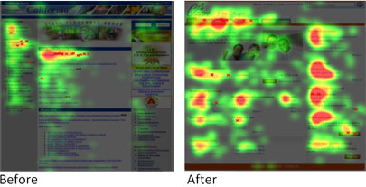
Figure 1: Before and after designs for the State Personnel Board of California. In the before image, users looked long at a few places and scanned the rest of the page. In the After image, participants perused the entire page and looked intently at many key opportunity elements.
If they don't see it, will you notice?
One problem with answering this question is that there is no effective way to directly ask it. If you retrospectively ask usability test participants what they looked at, their response will be influenced by their memory of what you asked them to do. You can ask them what they noticed, but self reporting of this sort is notoriously inaccurate – if you ask people to point to what they look at, and meld that with an eyetracking overlay of where their eyes actually went there is a startling gap. Anyway, we would be more interested to know what they didn't look at. And how do you ask that?
If you are willing to work with indirect data (and a slew of assumptions), you might look at your analytics. But looking at clicking patterns to deduce where people looked seems a stretch, too. And again, we are just as equally interested in where they didn't look. Is it reasonable to assume that if they didn't click they didn't look? It turns out, that assumption may not be as far fetched as it sounds.
How the Google checkout icon connected gazing with clicking
A recently reported marketing research study (SendTec, 2008) applied eyetracking methodologies to measure the attention-drawing effects of new and newly modified elements of search results pages. In and of itself, the study is not that interesting. Mostly it reports null or inconclusive results:
- Does putting a Google checkout icon in the right rail of a search result increase looking? No.
- Does placing a Google checkout icon in AdWord position 1,3 or 5 increase viewing? Not for positions 1 and 5. Maybe for 3, but the current study was inconclusive. A lot more data is needed.
- Does the icon draw peoples' eyes to itself (measured as fixations on) or induce increased clicks? No and no, respectively.
- Did changing the background color of the sponsored ads from blue to yellow increase the likelihood that people would look at them? Nope. Although, soothing background color not withstanding, longitudinal analysis over studies appears to indicate that people are becoming more willing to interact with sponsored ads.
However, mentioned as what seems to be an aside and detailed in the appendix (ok, not the footnotes, but...), the study also reports that there is a strong correlation where people look and where they click on search results pages*. OK, perhaps they didn't feel like they should amplify a finding that seems, well, obvious. But it's really the other side of their finding that is more important to designers: People are less likely to click where they don't look. Still seems too obvious?
It's interesting to watch people look at eye-tracking findings. They look a bit like hurricane maps. People get most excited about findings where the gaze patterns are highly organized... and look a bit like a well-formed hurricane. "See, the key element grabbed and drew participants attention. They lingered there. They were really drawn into the message. The visual design works!"
Maybe, if you are doing eyetracking analysis for print advertising. Think about it this way: The goal of a print ad is to convey one clear message. So print designers strive to draw you to and through one path (as was discussed in a previous newsletter). The eyetracking analysis of a print ad should look like a hurricane map: hot and organized.
In contrast, the goal of a website is to convey the range of information/interactions that provide value. So, the visual design objective of a website is to draw your attention to move around the page. As such, eyetracking results for a well-formed web page would look less like a hurricane and more like scattered (albeit intense) showers.
Hot spots – concerted looking – are good. But well distributed green spots – exploratory gazing – are equally important. Because, as the SendTec team points out, if you never look at a link, you are rather unlikely to click it.
Footnote
* The authors aggressively caution that the strong correlation between looking and clicking is observed with users looking at search results pages. Since user behavior on these pages may be unique, it is with some risk that we generalize this finding to other page types (e.g., landing pages). This caution is consistent with HFI's eyetracking: While longer looking times on non-search results pages do pattern with likelihood to click, longest looking times may not. In fact, longest looking times can, in some cases, reflect multiple lookbacks and dwell time indicating confusion or uncertainty about a next step, a label or an interaction. So, theirs is a valid concern. Additional publishable research is required to determine the strength of the correlation function for other page types. But the reverse premise may be the real finding: If people don't look at a link, they won't click.
References
California State Personnel Board case study, Human Factors International, (2007).
Eyetools Study Report: Does the Google Checkout icon attract more visual attention to right hand rail advertisements? SendTec.
Message from the CEO, Dr. Eric Schaffer — The Pragmatic Ergonomist

Having worked with eyetracking data since 1976, I am both very familiar and profoundly skeptical of its value. We can't tell if people are processing what they "see" and we can't tell what they feel by where they scan. But Kath points out an outstanding value for eyetracking. If there is no fixation we cannot possibly process the content. If there is no fixation we can't be influenced. Amazing, but the part we should pay attention to in our eyetracking results is probably the area that is NOT highlighted!! Fantastic insight Kath!
Leave a comment here
Reader comments
Wendy Clothier
Wachovia Securities
Response from Editors You can read all about it in the case study.
Burning question: What techniques did the state of California employee employ to get the improvement seen in the before and after heatmap pictures?
Vicki Davis
Westwood Schools
As a teacher who works with students on wikis, I find this fascinating. We are working to make sure we convey the message and we talk about design, but do we understand it, really. No, I don't think so.
I struggle with this because as I have my web pages, sometimes I have an assignment on the page and the students literally DON'T See it. Other times, they do. I think it is the design or where it is in the page, but I'm working on being able to figure it out.
I think those creating websites for teaching and learning should understand how to draw attention to certain areas and how to focus attention for learning. This is a fascinating article.
Volker Thoma
University of East London
The simple message in article title is wrong. Psychological studies using a priming methodology have shown that even if people fixate in the center of the screen, target objects to the left and the right (shown for a brief time to avoid saccades) and even ignored objects can be recognised, even if they are 4 degrees of visual angle (and probably more) away from fixation.
Thoma, V., Hummel, J.E., & Davidoff, J. (2004). Evidence for holistic representation of ignored images and analytic representation of attended images. Journal of Experimental Psychology: Human Perception and Performance, 30, 257-267.
Subscribe
Sign up to get our Newsletter delivered straight to your inbox
Privacy policy
Reviewed: 18 Mar 2014
This Privacy Policy governs the manner in which Human Factors International, Inc., an Iowa corporation (“HFI”) collects, uses, maintains and discloses information collected from users (each, a “User”) of its humanfactors.com website and any derivative or affiliated websites on which this Privacy Policy is posted (collectively, the “Website”). HFI reserves the right, at its discretion, to change, modify, add or remove portions of this Privacy Policy at any time by posting such changes to this page. You understand that you have the affirmative obligation to check this Privacy Policy periodically for changes, and you hereby agree to periodically review this Privacy Policy for such changes. The continued use of the Website following the posting of changes to this Privacy Policy constitutes an acceptance of those changes.
Cookies
HFI may use “cookies” or “web beacons” to track how Users use the Website. A cookie is a piece of software that a web server can store on Users’ PCs and use to identify Users should they visit the Website again. Users may adjust their web browser software if they do not wish to accept cookies. To withdraw your consent after accepting a cookie, delete the cookie from your computer.
Privacy
HFI believes that every User should know how it utilizes the information collected from Users. The Website is not directed at children under 13 years of age, and HFI does not knowingly collect personally identifiable information from children under 13 years of age online. Please note that the Website may contain links to other websites. These linked sites may not be operated or controlled by HFI. HFI is not responsible for the privacy practices of these or any other websites, and you access these websites entirely at your own risk. HFI recommends that you review the privacy practices of any other websites that you choose to visit.
HFI is based, and this website is hosted, in the United States of America. If User is from the European Union or other regions of the world with laws governing data collection and use that may differ from U.S. law and User is registering an account on the Website, visiting the Website, purchasing products or services from HFI or the Website, or otherwise using the Website, please note that any personally identifiable information that User provides to HFI will be transferred to the United States. Any such personally identifiable information provided will be processed and stored in the United States by HFI or a service provider acting on its behalf. By providing your personally identifiable information, User hereby specifically and expressly consents to such transfer and processing and the uses and disclosures set forth herein.
In the course of its business, HFI may perform expert reviews, usability testing, and other consulting work where personal privacy is a concern. HFI believes in the importance of protecting personal information, and may use measures to provide this protection, including, but not limited to, using consent forms for participants or “dummy” test data.
The Information HFI Collects
Users browsing the Website without registering an account or affirmatively providing personally identifiable information to HFI do so anonymously. Otherwise, HFI may collect personally identifiable information from Users in a variety of ways. Personally identifiable information may include, without limitation, (i)contact data (such as a User’s name, mailing and e-mail addresses, and phone number); (ii)demographic data (such as a User’s zip code, age and income); (iii) financial information collected to process purchases made from HFI via the Website or otherwise (such as credit card, debit card or other payment information); (iv) other information requested during the account registration process; and (v) other information requested by our service vendors in order to provide their services. If a User communicates with HFI by e-mail or otherwise, posts messages to any forums, completes online forms, surveys or entries or otherwise interacts with or uses the features on the Website, any information provided in such communications may be collected by HFI. HFI may also collect information about how Users use the Website, for example, by tracking the number of unique views received by the pages of the Website, or the domains and IP addresses from which Users originate. While not all of the information that HFI collects from Users is personally identifiable, it may be associated with personally identifiable information that Users provide HFI through the Website or otherwise. HFI may provide ways that the User can opt out of receiving certain information from HFI. If the User opts out of certain services, User information may still be collected for those services to which the User elects to subscribe. For those elected services, this Privacy Policy will apply.
How HFI Uses Information
HFI may use personally identifiable information collected through the Website for the specific purposes for which the information was collected, to process purchases and sales of products or services offered via the Website if any, to contact Users regarding products and services offered by HFI, its parent, subsidiary and other related companies in order to otherwise to enhance Users’ experience with HFI. HFI may also use information collected through the Website for research regarding the effectiveness of the Website and the business planning, marketing, advertising and sales efforts of HFI. HFI does not sell any User information under any circumstances.
Disclosure of Information
HFI may disclose personally identifiable information collected from Users to its parent, subsidiary and other related companies to use the information for the purposes outlined above, as necessary to provide the services offered by HFI and to provide the Website itself, and for the specific purposes for which the information was collected. HFI may disclose personally identifiable information at the request of law enforcement or governmental agencies or in response to subpoenas, court orders or other legal process, to establish, protect or exercise HFI’s legal or other rights or to defend against a legal claim or as otherwise required or allowed by law. HFI may disclose personally identifiable information in order to protect the rights, property or safety of a User or any other person. HFI may disclose personally identifiable information to investigate or prevent a violation by User of any contractual or other relationship with HFI or the perpetration of any illegal or harmful activity. HFI may also disclose aggregate, anonymous data based on information collected from Users to investors and potential partners. Finally, HFI may disclose or transfer personally identifiable information collected from Users in connection with or in contemplation of a sale of its assets or business or a merger, consolidation or other reorganization of its business.
Personal Information as Provided by User
If a User includes such User’s personally identifiable information as part of the User posting to the Website, such information may be made available to any parties using the Website. HFI does not edit or otherwise remove such information from User information before it is posted on the Website. If a User does not wish to have such User’s personally identifiable information made available in this manner, such User must remove any such information before posting. HFI is not liable for any damages caused or incurred due to personally identifiable information made available in the foregoing manners. For example, a User posts on an HFI-administered forum would be considered Personal Information as provided by User and subject to the terms of this section.
Security of Information
Information about Users that is maintained on HFI’s systems or those of its service providers is protected using industry standard security measures. However, no security measures are perfect or impenetrable, and HFI cannot guarantee that the information submitted to, maintained on or transmitted from its systems will be completely secure. HFI is not responsible for the circumvention of any privacy settings or security measures relating to the Website by any Users or third parties.
Correcting, Updating, Accessing or Removing Personal Information
If a User’s personally identifiable information changes, or if a User no longer desires to receive non-account specific information from HFI, HFI will endeavor to provide a way to correct, update and/or remove that User’s previously-provided personal data. This can be done by emailing a request to HFI at hfi@humanfactors.com. Additionally, you may request access to the personally identifiable information as collected by HFI by sending a request to HFI as set forth above. Please note that in certain circumstances, HFI may not be able to completely remove a User’s information from its systems. For example, HFI may retain a User’s personal information for legitimate business purposes, if it may be necessary to prevent fraud or future abuse, for account recovery purposes, if required by law or as retained in HFI’s data backup systems or cached or archived pages. All retained personally identifiable information will continue to be subject to the terms of the Privacy Policy to which the User has previously agreed.
Contacting HFI
If you have any questions or comments about this Privacy Policy, you may contact HFI via any of the following methods:
Human Factors International, Inc.
PO Box 2020
1680 highway 1, STE 3600
Fairfield IA 52556
hfi@humanfactors.com
(800) 242-4480
Terms and Conditions for Public Training Courses
Reviewed: 18 Mar 2014
Cancellation of Course by HFI
HFI reserves the right to cancel any course up to 14 (fourteen) days prior to the first day of the course. Registrants will be promptly notified and will receive a full refund or be transferred to the equivalent class of their choice within a 12-month period. HFI is not responsible for travel expenses or any costs that may be incurred as a result of cancellations.
Cancellation of Course by Participants (All regions except India)
$100 processing fee if cancelling within two weeks of course start date.
Cancellation / Transfer by Participants (India)
4 Pack + Exam registration: Rs. 10,000 per participant processing fee (to be paid by the participant) if cancelling or transferring the course (4 Pack-CUA/CXA) registration before three weeks from the course start date. No refund or carry forward of the course fees if cancelling or transferring the course registration within three weeks before the course start date.
Cancellation / Transfer by Participants (Online Courses)
$100 processing fee if cancelling within two weeks of course start date. No cancellations or refunds less than two weeks prior to the first course start date.
Individual Modules: Rs. 3,000 per participant ‘per module’ processing fee (to be paid by the participant) if cancelling or transferring the course (any Individual HFI course) registration before three weeks from the course start date. No refund or carry forward of the course fees if cancelling or transferring the course registration within three weeks before the course start date.
Exam: Rs. 3,000 per participant processing fee (to be paid by the participant) if cancelling or transferring the pre agreed CUA/CXA exam date before three weeks from the examination date. No refund or carry forward of the exam fees if requesting/cancelling or transferring the CUA/CXA exam within three weeks before the examination date.
No Recording Permitted
There will be no audio or video recording allowed in class. Students who have any disability that might affect their performance in this class are encouraged to speak with the instructor at the beginning of the class.
Course Materials Copyright
The course and training materials and all other handouts provided by HFI during the course are published, copyrighted works proprietary and owned exclusively by HFI. The course participant does not acquire title nor ownership rights in any of these materials. Further the course participant agrees not to reproduce, modify, and/or convert to electronic format (i.e., softcopy) any of the materials received from or provided by HFI. The materials provided in the class are for the sole use of the class participant. HFI does not provide the materials in electronic format to the participants in public or onsite courses.