Cool stuff and UX resources

Expert Reviews Require Expert Senses
Introduction
The following email request reflects a popular topic. In my answer to this email, I'll share a research-based "secret approach" to expert reviews that gives you "street cred" while speeding up your work.
Here's the email:
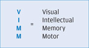
I have a question on Expert Reviews. When we do expert reviews in our company, we also look at the VIMM model.
I read your article on "Managing Your Defense Against GUI's from Hell" and found it be very informative, which led me to the following questions.
1) When I evaluate a website or a mobile application, I'm not able to categorize the relevant information correctly on classifying an issue under MOTOR, INTELLECT, and MEMORY.
Have you written any articles explaining in detail about what could be categorized under VIMM? [Visual, Intellectual, Memory, Motor issues.] The HFI courseware The Science and Art of Effective Web and Application Design lists very few points on VIMM model. I believe VIMM model is proprietary to HFI.
2) During our Expert Review observations, we create a high-level summary not exceeding 4 or 5 points. For example,
Is this the right format of presenting a high-level summary?
- Not able to locate information on home page
- Navigation from one page to another page is inconsistent.
3) As an expert reviewer, how do we present the high-level findings in a business perspective considering that we have done only an expert review? Usually we present the expert review findings to a business person who is unfamiliar with UX terminology.
My answer
These are great questions. Thanks for asking!
Expert reviews serve an important role in selling your UX expertise as well as getting the job done fast. The format must address both of these objectives.
You mention that your reader doesn't know UX terminology. That's OK. In reality, this helps you in both of those objectives (selling and fast work). You can drop the UX jargon and show your client you know how to make end-users happy. Keep reading to learn how.
Is the VIMM model proprietary to HFI?
In brief, no. UX represents application of "ergonomic science" to computer-based interactions. "Ergo-nomics" translates to the "science (nomics) of work (ergo)". Human factors textbooks have chapters on visual, intellectual, memory and motor work plus more.
However, HFI has used this model throughout its near-30 year history of training designers, starting with main frame 80-character UIs, then DOS, GUI, Web, Mobile, and in the future, Virtual Reality, and probably Neurogenic UIs!
Why such obsession with VIMM? Because all interface design focuses on the human effort or work needed to do an end-user task. What's your daily UX job? The answer is: "Reduce end-user work." That focus wins the day. VIMM is your language for programming the UI work-flow.
Eric Schaffer regularly points out that "designers are luckier than programmers. Programmers must work to learn a new computer language every couple years. But, humans haven't changed much in 10,000 years. This means UX designers can re-use their knowledge about humans every year."
What is "work" for humans? Well, it relates to the VIMM model...
- Visual work – like scanning a web page to find what you wanted
- Intellectual work – like figuring out what the navigation options really mean
- Memory work – like remembering hidden pull-downs, key codes, and work flow
- Motor work – like clicking icons to see if they navigate or clicking to find a window
You asked: "When I evaluate a website or a mobile application, I'm not able to categorize the relevant information correctly on classifying an issue under MOTOR, INTELLECT and MEMORY…"
Here's an example of how to categorize problems.
- If ragged left alignment slows down scanning – that's excessive visual work!
- If navigation terminology puzzled you – your intellect worked too much!
- If you got confused by the workflow – your memory replaced self-evident design!
- If you clicked too much due to mistake you made – errors created excess motor work!
Now you know about the power of the VIMM model.
Next I'll share how to put it to use in building street cred with your clients. Also, you'll learn how talk the talk while avoiding mind-numbing jargon.
Get street credibility, or better yet, get street cred
A February 2011 "case study" in the Journal of Usability Studies discussed how to sell your usability services. It suggests we should abandon jargon and embrace the language of our management and customers.
UX architect Misha Vaughan of Oracle USA suggests these 2 bullet points, among others:
- "Don't over-communicate the UX methodology. Yeah, we love process, but customers are only mildly interest, if at all.
- Drive the value of UX home for customers; focus on the result that customers' organizations will gain from the improved usability/user interface. Will staff be more productive? Will they reduce the number of calls to their support desk? Will they reduce the amount of time and money spent training end users?"
Where does the VIMM model fit Misha's commandments?
| Misha's Commandments | VIMM Result |
|---|---|
Don't over-communicate the UX methodology. |
OK, let's talk VIMM. Everyone understands Work. Plus, everyone understands Visual, Intellectual, Memory, and Motor when you show them examples of problems. This common language gives you street cred. (OK – "motor" means "movement-related"). Your customers may not appreciate "research" but they can appreciation faster scanning, fewer clicks, and fewer errors. This is not jargon. The VIMM model takes you beyond jargon and back to gut-level communication. |
Will staff be more productive? |
VIMM address the speed with which all activities occur. Fast VIMM means "more productivity". Identify roadblocks to VIMM speed, and you have a plan of action! |
Will they reduce the number of calls to their support desk? |
Intellectual work means "problem solving". When end-users must solve puzzles in a UI design then they make expensive calls to the help desk. Identify those intellectual puzzles. They're typically navigational problems, but they can be unfamiliar vocabulary or unfamiliar task flows. |
Will they reduce the amount of time and money spent training end users? |
Unclear task flows require memorization. Memorization requires training. Training requires time and money. Make your UI more self-evident to reduce memory needs and subsequent training time. |
Can you handle "the secret" of expert review?
You may have forgotten the title of this UI Review: "Expert Reviews Require Expert Senses"
This title tells you my secret to good expert reviews. And has a basis in research discussed in our December 2009 UI Review: "User Experience" meets "Beauty is Truth, Truth is Beauty". This article tells you that end-users define beauty and truth primarily in terms of "processing fluency".
In short: fast and easy make things appear beautiful as well as appear true.
Here's how to make it work.
- DON'T look at the UI for review until you are ready. If you happen to use it or look at it, just try to forget it.
- Ask what types of users will interact with the site or application? Do they need special knowledge? (If so, you must learn it or get a helper.) For public web sites, let's assume your knowledge is good enough. Write down the user groups, and role play each group one at a time.
- Ask yourself: "Do I know too much about his topic?" If so, try to forget it and pretend you are an average user. (This can be difficult. Just dumb down!)
- OK. Now use the site or application with tasks suited to each user group. BUT USE THIS SECRET: TUNE IN TO YOUR SENSES: VISUAL, INTELLECTUAL, MEMORY, AND MOTOR!
- You must evaluate all 4 VIMM elements simultaneously. But you can learn to do it, just like you learned to ride a bike, play the piano, or drive a car. All these activities require "simultaneous processing". Make a list with 4 columns: V....I....M....M. Make notes of your experience at each step of your tasks.
- Again, I repeat "TUNE IN TO YOUR SENSES". Sounds easy, doesn't it?
- But wait a minute, isn't it easy to be professional wine taster? Maybe not! Read this excerpt from Wikipedia on Wine Tasting (looks like a CVIECC model!):
There are five basic steps in tasting wine: color, swirl, smell, taste, and savor... During this process, a taster must look for clarity, varietal character, integration, expressiveness, complexity, and connectedness. (My italics.)
- But wait a minute, isn't it easy to be professional wine taster? Maybe not! Read this excerpt from Wikipedia on Wine Tasting (looks like a CVIECC model!):
- You get the idea. VIMM is a subjective approach. But just like the wine taster, you are a fully trained surgeon of UX knowledge! We have abandoned jargon, methodology, and research citations for the sake of clear communication. We now use Visual, Intellectual, Memory, and Motor work as our guide.
- BUT ONLY YOU, THE COMPETENT UX PRACTITIONER CAN ACCOMPLISH THIS SOPHISTOCATED EVALUATION. This works only because…
- You know what good design feels like.
- You know what pitfalls can mess up a design.
- You have read the research that will support your feelings.
- Your usability testing gives you insight into human failures.
- You have confidence in your own experiences.
- Your UX colleagues can back you up if they have equal sensitivity.
Wrapping up on VIMM for expert reviews
Now that you have a list of issues for each user group, you can decide how to get the best mileage in your presentations to your client.
I have found two major approaches, depending on your mission. I know you can define other approaches. But this will get you started.
1. If the site is so big, and your expert review is only a "sample", then present your findings as "training" in usability design. Indicate to your client...
"Our end-users can easily be overloaded when using our web site. We need to understand the limits to our users' ability to process information. We will show you examples how your current design creates excessive Visual work, Intellectual work, Memory work, and Motor work for our users in each group.
We invite you to apply these principles to your entire site to improve the user experience."
This implies that you discuss each user group in light of their most characteristic task. Then show several important examples for each of the VIMM categories.
You can elect to show redesign examples as well. I've found that the quick re-designs re-enforce the VIMM findings and impress the client with the value of usability insights.
2. If the site is small enough, or your mission specific enough, then "go for it". Critique as much as you can. Often this means you will focus on one task flow, but then analyze each screen, one at a time. You may offer comments that mix Visual, Intellectual, Memory, and Motor findings.
In fact, a single design issue may easily represent 2, or even 3, of these categories! (Show it, too.) Avoid too many critiques on a single presentation page. You may need 3, 4, or more slides to show all the problems on a single web page.
"Here are the challenges facing this end-user group who traditionally must accomplish task A. We will show you how each screen in this design slows down users with various obstacles that we identify for simplicity as Visual work, Intellectual work, Memory work, and Motor work.
We feel confident that fixes to each of our findings will give your end-users the experience they want in a professionally designed site."
How do you feel about these two approaches? The first will help train the reader in applying their own intuitive sense of VIMM analysis. We hope they will find other problems through that experience.
The second attempts to do a "full analysis" that takes your reader through the detailed fixes required to provide "processing fluency". (Read that UI Review article for the full impact.)
Either of these approaches provides a valuable, professional service to your client. And like a professional wine-taster, you have been fast, productive, and complete in your own right by using the VIMM model.
Ah, but wait. Progress catches up to us.
OK, I cannot tell a lie. There is more to the story.
What about sound ("Auditory work") and what about gestures ("Kinesthetic work")?
Life catches up to us with our smart phones, virtual reality, and neurogenic software.
OK, call it the VIMMAK model, if you wish. (Note the extra visual work reading this longer acronym. Also, would anybody remember it?)
But I was trying to keep it intellectually simple, at least for this introductory UI Review.
Well, VIMM is easier to type, as well. ![]()
References
Mish W. Vaughan (2011). Tough Sell: Selling User Experience. Journal of Usability Studies, 6(4) 48-51.
John Sorflaten (2009). User Experience" meets "Beauty is Truth, Truth is Beauty. Retrieved from HFI UI Review 27 June, 2012.
Message from the CEO, Dr. Eric Schaffer — The Pragmatic Ergonomist

Oh damn. I'm busted.
For decades I've used this VIMM magic trick to impress potential customers and amuse the public. Throw up a screen of any type and I can talk for a half hour at least on the opportunities for improvement.
I did this even with the venerable Google main page a couple of years ago (it's a bit tighter now).
So you too can do it! It just takes practice and a solid knowledge of the scientific principles.
And it's also great for your design quality. "I can't find things on the home page" is useless. But "This has more than 10 items in the list without grouping!" is actionable.
Leave a comment here
Reader comments
Cheryl Magnuson
Intermec
This article paints a brilliant picture! Many will benefit!
Ravi Chandrasekaran
Accenture
I like this VIMM concept very much. I feel the VIMM evaluation, Heuristic evaluation, expert review, Usabilty review, Taskflow review, Empherical review, Design review etc...are different flavours of UX reviews. It is all about how we articulate to the stakeholders and making them understand about the severity on the rating. However, I am sure 'VIMM' technique has a significant imapact to whomsoever the audience is, as it is simple. Thank you once again for the wonderful article !
Marla Newman
HP
Wonderful article. Great practical advice on the use of the VIMM model. Thank you!
T S S Ganesan,
Cognizant
Good and a useful newsletter. I like the addition of AK to VIMM
Subscribe
Sign up to get our Newsletter delivered straight to your inbox